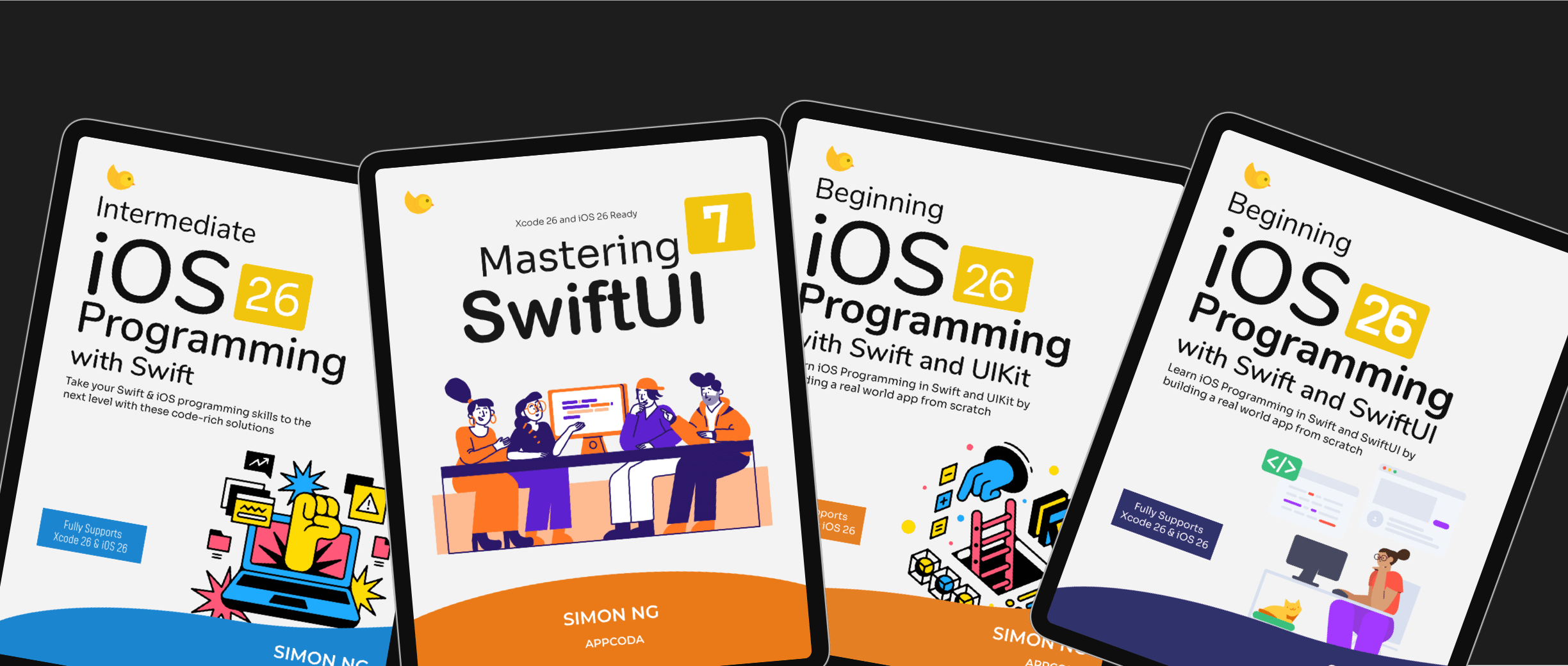
Announcing Mastering SwiftUI 7 for iOS 26 and Xcode 26
We’re excited to announce the release of Mastering SwiftUI 7, fully updated for iOS 26 and Xcode 26. This

Kickstart your app development journey with our tutorials and ebooks. Learn iOS programming step-by-step to transform your innovative ideas into fully functional apps.
Subscribe to receive a free ebook and tutorial updates.

We’re excited to announce the release of Mastering SwiftUI 7, fully updated for iOS 26 and Xcode 26. This

With iOS 26, Apple introduces the Foundation Models framework, a privacy-first, on-device AI toolkit that brings the same language models

In an earlier tutorial, we shared how to create a custom tab bar view using SwiftUI to replace the standard

We’re excited to announce the release of Mastering SwiftUI 7, fully updated for iOS 26 and Xcode 26. This

Live Activities, first introduced in iOS 16, are one of Apple's most exciting updates for creating apps that

Have you ever wondered how to make your app’s features accessible from the built-in Shortcuts app on iOS? That’

In the previous tutorials, we explored how Foundation Models work in iOS 26 and how you can start building AI-powered

In the previous tutorial, we introduced the Foundation Models framework and demonstrated how to use it for basic content generation.

With iOS 26, Apple introduces the Foundation Models framework, a privacy-first, on-device AI toolkit that brings the same language models

In iOS 26, SwiftUI finally introduced one of its most highly anticipated components: WebView, a native solution for displaying web

We've covered iOS localization in several tutorials, including one that shows how to fully localize an app using

With the release of iOS 18, Apple has unveiled a suite of exciting features under the Apple Intelligence umbrella, and

We're thrilled to announce that our Mastering SwiftUI ebook has been fully updated for iOS 18 and Xcode

Apple's engineers may have long recognized the widespread desire among iOS developers to recreate the elegant hero animation

The Vision framework has long included text recognition capabilities. We already have a detailed tutorial that shows you how to
Not everyone can become a professional developer, but we firmly believe that anyone can learn Swift and build their own app, even without prior programming experience. Our learning materials have been tried and tested by over 25,000 readers from various backgrounds. Many of our students have been able to release their own apps or become job-ready developers after completing the course. Whether you're a programmer looking to learn a new language, a designer aiming to transform your designs into iOS apps, or an entrepreneur interested in coding, our learning materials are designed for you.
