Have you tried to create a custom control in older versions of Xcode? It’s not that easy. What makes it so hard is that you couldn’t see your design in the Interface Builder. Every time you want to review the design changes, you can only test the control in the simulator. That’s troublesome. You would probably need to spend hours and hours on designing a single component.
With the release of Xcode 6, Apple introduced a new feature known as IBDesignable and IBInspectable for developers to build custom controls and allowed us to live preview the design right in the Interface Builder. Quite obviously, this is a huge productivity benefit.
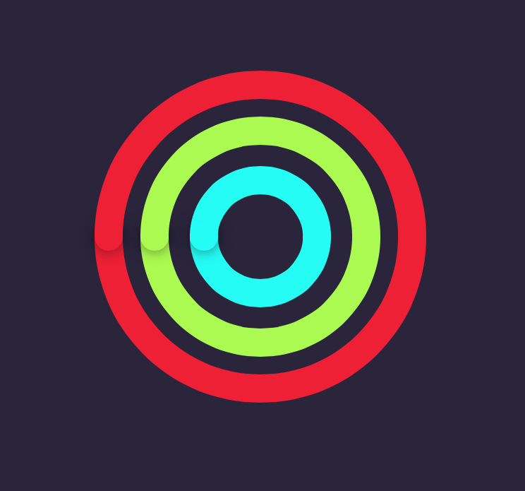
In this tutorial, I will give you an introduction to IBDesignable and IBInspectable, and show you guys how to take advantage of the new feature. There is no better way to elaborate a feature than creating a demo. So we will build a custom interface called “Rainbow” together.
IBDesignable and IBInspectable
With IBDesignable and IBInspectable, developers are allowed to create interface (or view) that renders in Interface Builder in real time. In general, to apply this new feature, all you need to do is create a visual class by subclassing UIView or UIControl and then prefix the class name with @IBDesignable keyword in Swift. If you are using Objective-C, you use IB_DESIGNABLE macro instead. Here is a sample code in Swift:
@IBDesignable
class Rainbow: UIView {
}
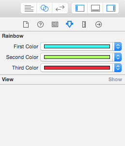
In older versions of Xcode, you can edit the user-defined runtime attributes to change properties of an object (e.g. layer.cornerRadius) in Interface Builder. The problem is you have to key in the exact name of the properties. IBInspectable takes a step forward. When you prefix a property of the visual class with IBInspectable, the property will be exposed to the Interface Builder such that you can change its value in a much straightforward way:
Again if you are developing your app in Swift, what you have to do is just prefix your chosen property with the keyword @IBInspectable. Here is a sample code snippet:
 @IBInspectable var firstColor: UIColor = UIColor.blackColor() {
     // Update your UI when value changes
 }
Getting confused? No worries. You will understand what I mean after going through the project demo.
Building Your Xcode Project
Let’s get started by creating a new project in Xcode and choose Single View Application as a template, and name it RainbowDemo. We will use Swift in this project as the programming language, so don’t forget to choose it when creating the project.
Once finished, select the Main.storyboard in the Project Navigator and drag a View object from the Object Library to the View Controller. Change its color to #38334C (or whatever color you want) as well as set its size to 600 by 434. Then put it in the center of the main view. Don’t forget to change the color of the main view to the same color of the view object.
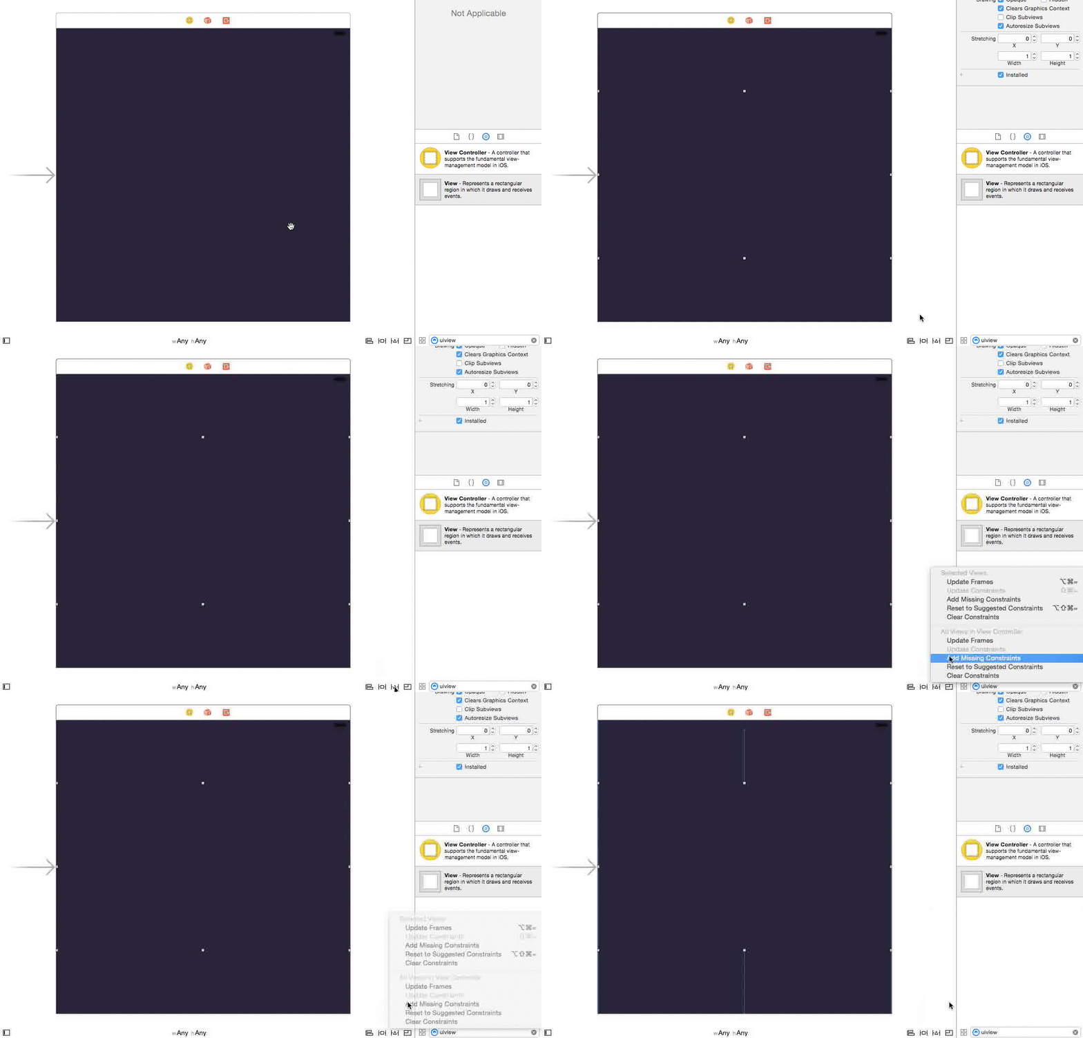
With Xcode 6, you have to configure auto layout constraints for the view in order to support all types of iOS devices. Auto Layout is pretty powerful in the latest version of Xcode. For simple constraints, you can just click the Issues option of the Auto Layout menu and choose “Add Missing Contraints”, and Xcode will automatically configure the layout constraints for the view.
Creating Custom View Class
Now that you’ve created the view in storyboard, it’s time to create our custom view class. We’ll use the Swift class template for the class creation. Name it “Rainbow”.
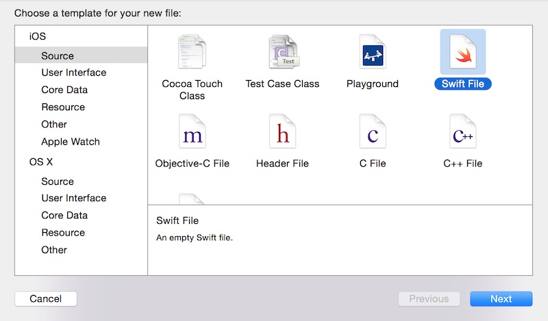
Then insert the following code in the class:
import UIKit

class Rainbow: UIView {
    required init(coder aDecoder: NSCoder) {
        super.init(coder: aDecoder)
    }

    override init(frame: CGRect) {
        super.init(frame: frame)
    }
}
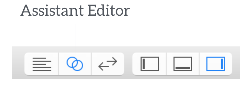
As mentioned before, the visual class is a subclass of UIView. In order to use our custom class in live rendering, we need to override both initializers as shown above. Next split the view by selecting the assistant editor:
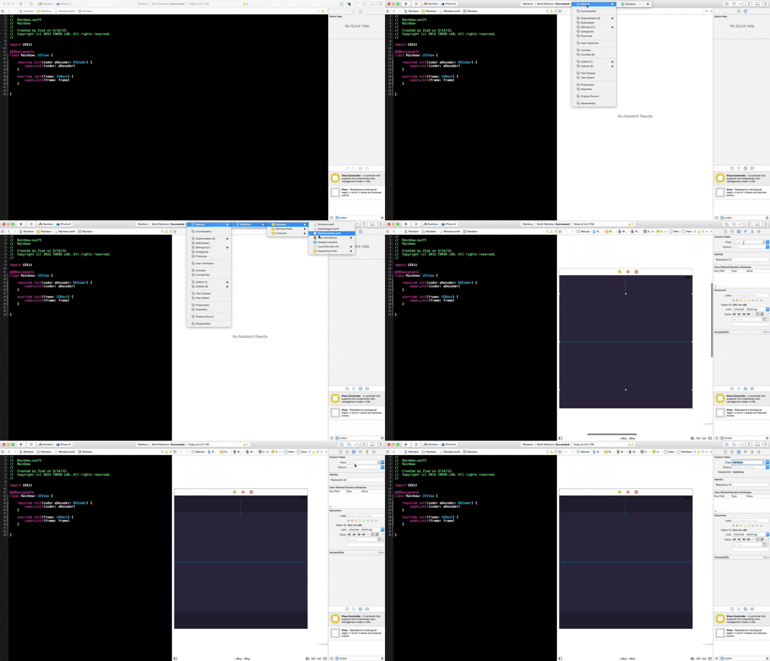
Once done, select the main storyboard in the assistant editor, so you can see what you are building in real time. Remember to change the class name of the view to “Rainbow” under the Identity inspector:
Implementing IBDesignable Controls
The first step to enable a control for live rendering is to set the custom view as Designable by prefixing the class name with @IBDesignable:
@IBDesignable
class Rainbow: UIView {
    ...
}
It’s kinda simple as you can see. But this simple keyword would make your development much easier. Next, we will add a few properties for setting the colors of the circles. Insert these lines of code in the Rainbow class:
@IBInspectable var firstColor: UIColor = UIColor(red: (37.0/255.0), green: (252.0/255), blue: (244.0/255.0), alpha: 1.0)
@IBInspectable var secondColor: UIColor = UIColor(red: (171.0/255.0), green: (250.0/255), blue: (81.0/255.0), alpha: 1.0)
@IBInspectable var thirdColor: UIColor = UIColor(red: (238.0/255.0), green: (32.0/255), blue: (53.0/255.0), alpha: 1.0)
Here, we predefine each property with a default colour, and tell it to redraw the view each time a user changes its value. Most importantly, we prefix each property with the @IBInspectable keyword. If you go to the Attributes inspectable of the view, you should find these properties visually:
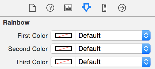
Cool, right? By indicating the properties as IBInspectable, you can edit them visually using color picker.
Okay let’s move to implement the main methods of the Rainbow class, which is used to draw a circle on the screen. Insert the following method in the class:
func addOval(lineWidth: CGFloat, path: CGPathRef, strokeStart: CGFloat, strokeEnd: CGFloat, strokeColor: UIColor, fillColor: UIColor, shadowRadius: CGFloat, shadowOpacity: Float, shadowOffsset: CGSize) {

    let arc = CAShapeLayer()
    arc.lineWidth = lineWidth
    arc.path = path
    arc.strokeStart = strokeStart
    arc.strokeEnd = strokeEnd
    arc.strokeColor = strokeColor.CGColor
    arc.fillColor = fillColor.CGColor
    arc.shadowColor = UIColor.blackColor().CGColor
    arc.shadowRadius = shadowRadius
    arc.shadowOpacity = shadowOpacity
    arc.shadowOffset = shadowOffsset
    layer.addSublayer(arc)
}
To make the code clean and readable, we create a common method for drawing a full or half circle according to the parameters provided by the caller. It’s pretty straightforward to draw a circle or an arc using CAShapeLayer class. You can control the start and end of the stoke using the strokeStart and strokeEnd properties. By varying the value of stokeEnd between 0.0 and 1.0, you can draw a full or partial circle. The rest of the properties are just used to set the color of a stroke, shadow color, etc. You can check out the official documentation for details of all the properties available in CAShapeLayer.
Next, insert the following methods in the Rainbow class:
override func drawRect(rect: CGRect) {
    // Add ARCs
    self.addCirle(80, capRadius: 20, color: self.firstColor)
    self.addCirle(150, capRadius: 20, color: self.secondColor)
    self.addCirle(215, capRadius: 20, color: self.thirdColor)
}

func addCirle(arcRadius: CGFloat, capRadius: CGFloat, color: UIColor) {
    let X = CGRectGetMidX(self.bounds)
    let Y = CGRectGetMidY(self.bounds)

    // Bottom Oval
    let pathBottom = UIBezierPath(ovalInRect: CGRectMake((X - (arcRadius/2)), (Y - (arcRadius/2)), arcRadius, arcRadius)).CGPath
    self.addOval(20.0, path: pathBottom, strokeStart: 0, strokeEnd: 0.5, strokeColor: color, fillColor: UIColor.clearColor(), shadowRadius: 0, shadowOpacity: 0, shadowOffsset: CGSizeZero)

    // Middle Cap
    let pathMiddle = UIBezierPath(ovalInRect: CGRectMake((X - (capRadius/2)) - (arcRadius/2), (Y - (capRadius/2)), capRadius, capRadius)).CGPath
    self.addOval(0.0, path: pathMiddle, strokeStart: 0, strokeEnd: 1.0, strokeColor: color, fillColor: color, shadowRadius: 5.0, shadowOpacity: 0.5, shadowOffsset: CGSizeZero)

    // Top Oval
    let pathTop = UIBezierPath(ovalInRect: CGRectMake((X - (arcRadius/2)), (Y - (arcRadius/2)), arcRadius, arcRadius)).CGPath
    self.addOval(20.0, path: pathTop, strokeStart: 0.5, strokeEnd: 1.0, strokeColor: color, fillColor: UIColor.clearColor(), shadowRadius: 0, shadowOpacity: 0, shadowOffsset: CGSizeZero)

}
The default implementation of the drawRect method does nothing. In order to draw circles in the view, we override the method to implement our own drawing code. The addCircle method takes in three parameters: arcRadius, capRadius and color. The arcRadius is the radius of the circle, while the capRadius is the radius of the rounded cap.
The addCircle method makes use of UIBezierPath to draw the arcs and it works like this:
- First it draws a half circle at the bottom
- Next it draws a full small circle at the edge of the arc.
- Finally, it draws the other half of the circle
In the drawRect method, we call the addCircle method three times with different radius and color. This figure illustrates how the circles are drawn:

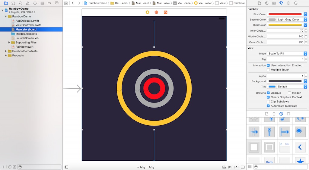
With the IBInspectable properties, you are now free to change the color of each circle right in the Interface Builder without diving into the code:
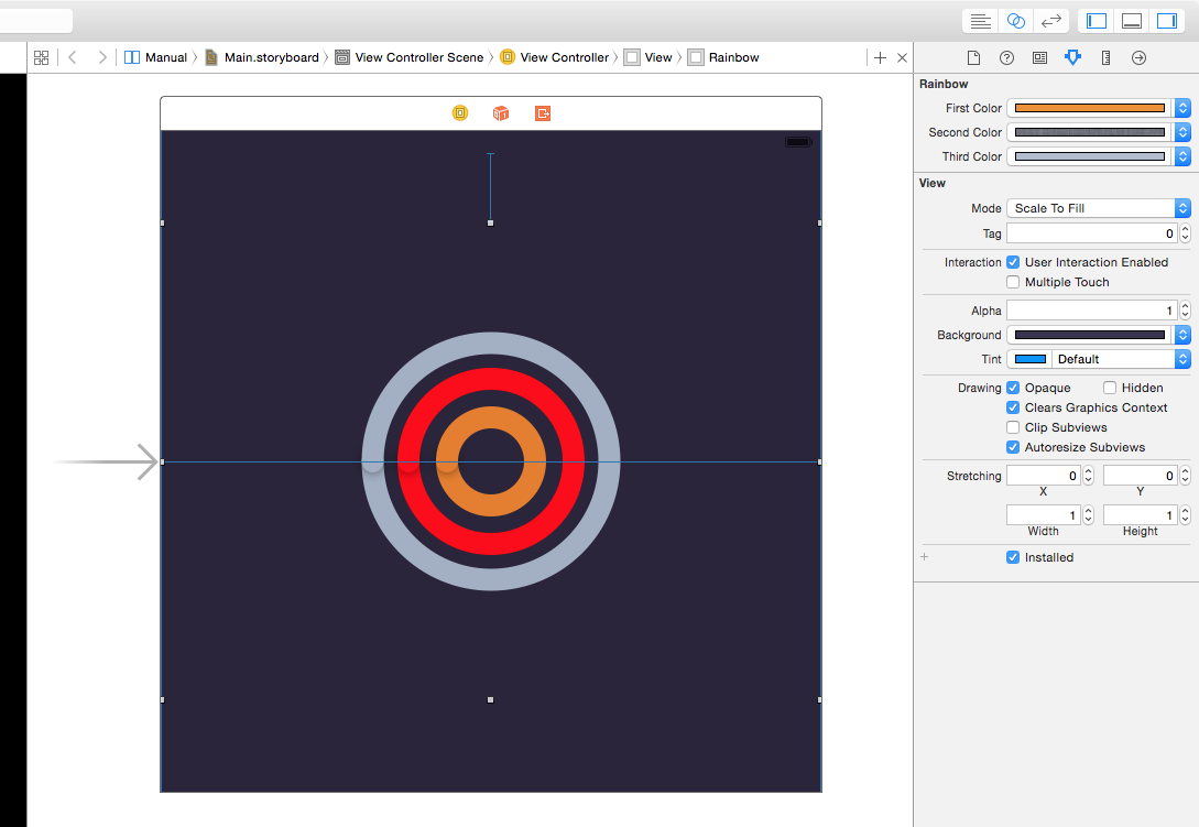
Obviously, you can further expose arcRadius as an IBInspectable property. I’ll leave it as an exercise for you.
Summary
After going through this tutorial, I hope that you now understand how to use both IBDesignable and IBInspectable in Xcode 6. With the real-time preview in the Interface Builder, this new feature would allow you to create custom componenents in a more effcient way.
For your reference, you can download the complete Xcode project from here. As always, leave me comment and share your thought about the tutorial.


