Editor’s note: If you’ve downloaded the Xcode 6 beta and played around with it, one thing you may notice is the change of Interface Builder. The default view controller is now wider and doesn’t look like an iPhone 5. When you position a button in the center of the view and run the app, it doesn’t look good. The button is not centered properly.
What’s wrong? How can you make it right? The answer is Auto Layout. Auto Layout is a constraint-based layout system. It allows developers to create an adaptive interface that responds appropriately to changes in screen size and device orientation. We seldom talk about Auto Layout in our tutorials. Some beginners find it hard to learn and avoid using it. Starting from Xcode 6, you should learn to love Auto Layout. Apple is expected to release 4.7-inch and 5.5-inch iPhone 6 this fall. Without using Auto Layout, it would be very hard for you to build an app that supports all screen sizes.

So starting from this week, we’ll publish a series of articles about Auto Layout. We’ll start with the basics.
Enter the introduction of Auto Layout by Ziad.
I know that there are many developers who hates Auto Layout, maybe because it’s relatively new or it’s hard to use for the very first time. But believe me, once you get comfortable with it, it becomes one of your greatest tools that you can’t live without when developing your app. In this tutorial, I will give you a very brief introduction of Auto Layout.
Why Auto Layout?
Auto Layout is a way that lets developers create user interface by defining relationships between elements. It provides a flexible and powerful system that describes how views and the UI controls relate to each other. By using Auto Layout, you can get an incredible control over layout, with a wide range of customization, and yield the perfect interface.
Auto Layout is a fantastic tool. It does things that earlier technologies could never dream of. From the edge case handling of creation of reciprocal relationships between views, Auto Layout introduces immense power. What’s more, Auto Layout is compatible with many of Apple’s most exciting application programming interfaces (APIs), including animations, motion effects, and sprites.
Okay, let me give you an example and hopefully you’ll have a better idea why Auto Layout is needed. In Storyboard, you place a button right in the center of the view. Run the app on both iPhone Retina (3.5-inch) and iPhone Retina (4-inch) simulators.
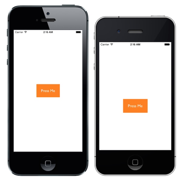
You’ll end up with the above results and it turns out that the button isn’t centered when running on a 3.5-inch device.
Why? What’s wrong with it?
Without using Auto Layout, the UI controls (e.g. button) we layout in the Storyboard is of fixed position. In other words, we “hard-code” the frame origin of the control. For example, the “Press Me” button’s frame origin is set to (104, 255). Therefore, whether you’re using a 3.5-inch or 4-inch device, iOS will draw the label in the specified position. This explains why the “Press Me” button was not displayed properly on a 3.5-inch iPhone, for which the screen height is different.
Obviously, we want to the app look good on both 3.5-inch and 4-inch iPhone. And this is why we need Auto Layout.
How To Use Auto Layout in Interface Builder
Before we show you how to fix the alignment issue in the example, let’s have a brief walkthrough of the Interface Builder and get to know how Auto Layout can be applied.
First, set up a new project based on the Single View Application iOS app template. In the project options, choose iPhone for the device family, save the project, then open the Storyboard. You will notice a menu at the bottom-right corner. The buttons in the menu are related to Auto Layout. You can use for alignment, sizing, spacing and resolving constraint issue.
- Align – Create alignment constraints, such as aligning the left edges of two views.
- Pin – Create spacing constraints, such as defining the width of a UI control.
- Issues – Resolve layout issues.
- Resizing – Specify how resizing affects constraints.

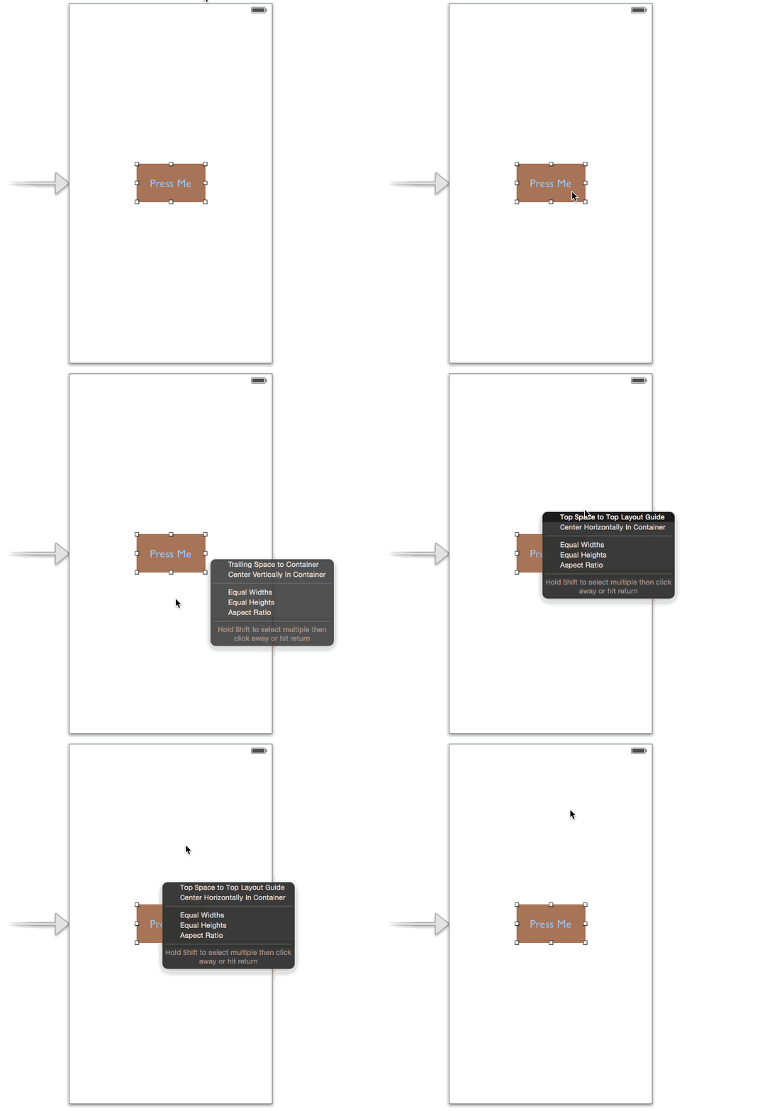
Other than the Auto Layout menu, Apple has made it flexible for developer to setup Auto Layout by using Control+drag. You simply control-drag from any view to another view to set constraints between each other. When you release the mouse, it presents a list of possible constraints for you to select from.
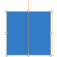
Once you setup a constraint in a view, the constraint line is displayed in either in orange or blue. The orange constraint lines indicates that there are insufficent constraints and you need to fix it.
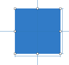
The blue constraint line indicates that your view layout is being setup correctly and there is no ambiguity.
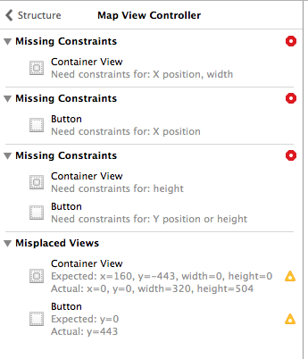
Sometimes after you create the constraint, the Interface Builder outline view shows a disclosure arrow. The red arrow also indicates that there are conflicts or ambiguities. Click the disclosure arrow, and you’ll see a list of the issues. The issues are displayed on a scene-by-scene basis. Typical issues include missing constraints, conflicting constraints and misplaced views.
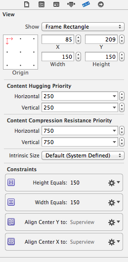
In the Size Inspector, you can view a list of all the constraints that have been added. These constraints appear in a section called “Constraints”.
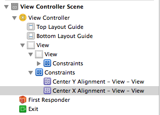
In addition to the size inspector view, the constraints also appear in the Interface Builder Outline under the corresponding view.
Auto Layout Example – Center a Button or Image
By now, you should have a basic understanding of Auto Layout and how you can configure constraints. Let’s consider the example again and see how we can center a button or an image.
As mentioned before, Auto Layout is a constraint-based layout system. It allows developers to create an adaptive interface that responds appropriately to changes in screen size and device orientation. Okay, it sounds good. But what does the term “constraint-based layout” mean? Let me put it in a more descriptive way. Consider the “Press Me” button again, how do you describe its position? Probably you’ll describe like this.
The button should be centered both horizontally and vertically, regardless of the screen size.
Here you already define two constraints (centered horizontally and centered vertically). These constraints express rules for the layout of label in the interface. Auto Layout is all about constraints. The constraints, however, are expressed in mathematical form. For example, if you’re defining the position of a button, you might want to say “the left edge should be 30 points from the left edge of its containing view.” This translates to button.left = (container.left + 30).
Okay, that’s quite enough for the Auto Layout concept.
Now let’s see how to center an image view in the middle of the screen regardless of the screen size and orientation (portrait / landscape).
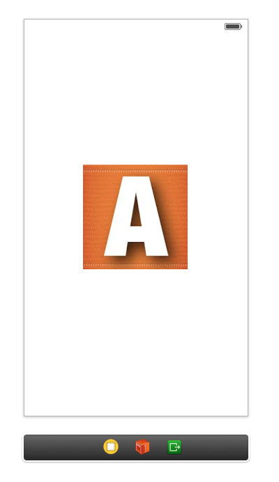
Assuming you’ve added an image view and placed it in the center of the view, the first step is to add the width and height constraints. In this example, we’ll show you how to use Auto Layout menu to apply the constraints. Select the image view and then click the Pin icon in the Auto Layout menu. Select height and width, then hit the “Add 2 constraints” button.
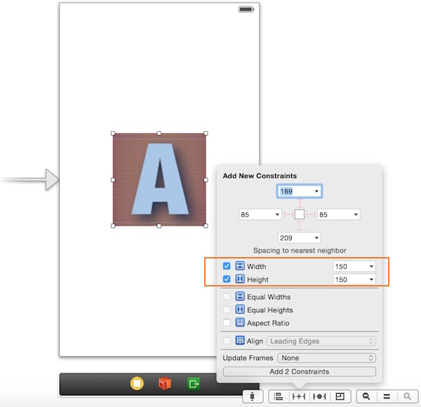
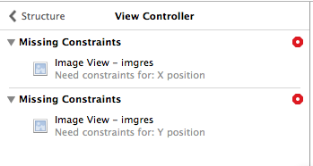
You may notice that a red arrow appears in the Interface Builder outline. This tells us that there are some constraint problems with our image view. Xcode can help us fix them. Simply click on that red arrow, followed the red indicator and finally click “Add missing constraints”.
Okay, we have set the size constraints. Next we’ll set another constraint to centre the image view even if the users rotate the device to landscape orientation. To do that, select the image view and click the Alignment icon in the Auto Layout menu. In the pop-over menu, select both “Vertical center in container” and “Horizontal center in container” options, followed by clicking the “Add Constraints” button.
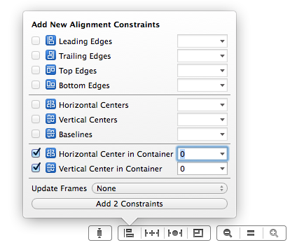
Now you’re ready to test your app. Compile and launch the App. Try to switch between portrait and landscape mode. You will see that the image view stays centered.

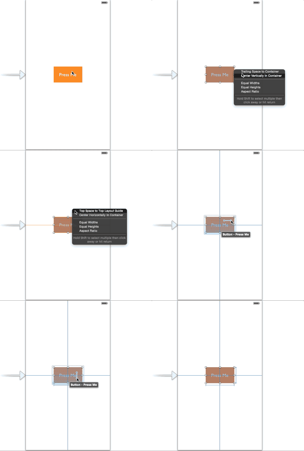
Here we just demonstrate how to use Auto Layout menu to add constraints. You can do the same thing by using control-drag. The below image illustrates how it can be done.
Auto Layout Example – Login Button
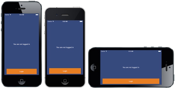
As you know, the display of iPhone 5 and iPhone 4 are of different size. It will need some tweaks to support both screen size. Consider the below login screen, the login button is placed at the bottom of the view. If you haven’t applied Auto Layout, the app may not be able to display the login button on a 3.5-inch device.
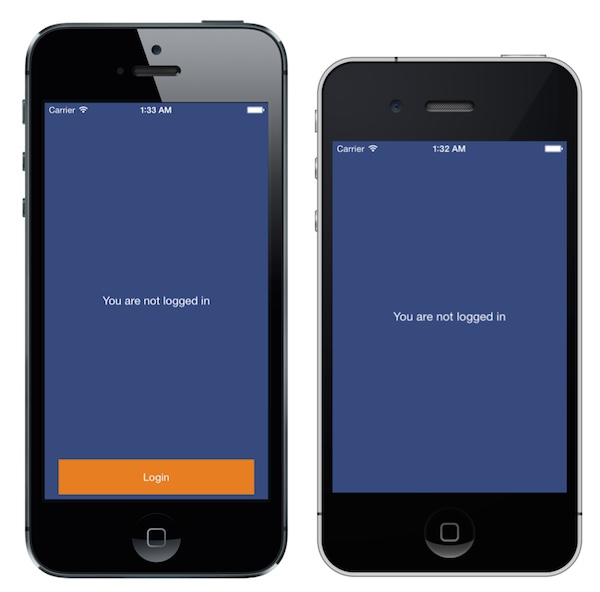
So how can you resolve this issue? Again, to fix that we need to setup a constraint to make it stay to the bottom of the screen. On top of that, its width should be changed when it’s in the landscape mode.
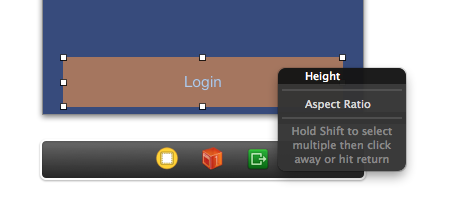
First we’ll add a size constraint for the height of the button. We only add a constraint for the height as the width will change depending on the device’s orientation. control-drag vertically the button and choosing “height”, then fix the ambiguity in the Interface Builder Outline by adding all the missing constraints.
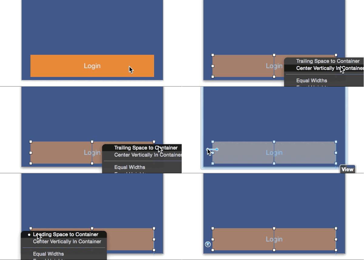
To ensure the button maintains the same distance from the sides of the view (whether it’s in portrait or landscape mode), we need to add another constraint. Control-drag from the button to the left side of the superview and select “leading space to the container”. Repeat the same procedure for the right side and select “trailing space to the container”.
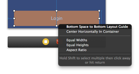
The last step is to add a constraint such that the button stays to the bottom of the view. Control-drag from the button to the bottom of the superview and select “bottom space to bottom layout”.
Now, you can build and run the project on any devices. Thanks to Auto Layout. The login button should display correctly on 3.5-inch iPhone. And the login button scales proportionally when the device is rotated.
What’s Coming Next
In this tutorial, we covered the basics of Auto Layout using Interface Builder. I hope you start to love Auto Layout after going through the tutorial and examples. Auto Layout is very powerful once you manage the basics. You’ll be able to build adaptive UI to fit multiple screen sizes. In the upcoming tutorials, we will cover more Auto Layout examples and show you how to use Auto Layout programmatically.
For your complete reference, you can download the Xcode project from here.
What do you think about the tutorial and Auto Layout? Leave me comment and share your thought.


