In iOS 16, other than introducing the new NavigationStack, Apple also released a new view container named NavigationSplitView for developers to create two or three column navigation interface. If you want to build UI similar to the stock Mail app, you should check out this split view component.
While NavigationSplitView is more suitable for iPadOS and macOS apps, you can also use it on apps for iPhone. The view component automatically adapts itself for iPhone. Instead of displaying a multi-column interface, it creates a single-column experience.
The new NavigationSplitView comes with various options for you to customize its appearance and operations. You can change the column width and programmatically show/hide the columns.
In this tutorial, we will create a three-column navigation UI using NavigationSplitView.
Let’s get started.
The Basic Usage of NavigationSplitView
The NavigationSplitView supports both two-column and three-column navigation experience. Their implementations are quite similar. To create a two-column navigation UI, you write the code like this:
NavigationSplitView {
  // Menu bar
} detail: {
  // Detail view for each of the menu item
}
For 3-column navigation interface, you add the content parameter in between:
NavigationSplitView {
  // Menu bar
} content: {
  // Sub menu
} detail: {
  // Detail view for each of the sub-menu item
}
We will start with the two-column navigation UI and eventually build the three-column design.
Building the 2-Column Navigation Interface
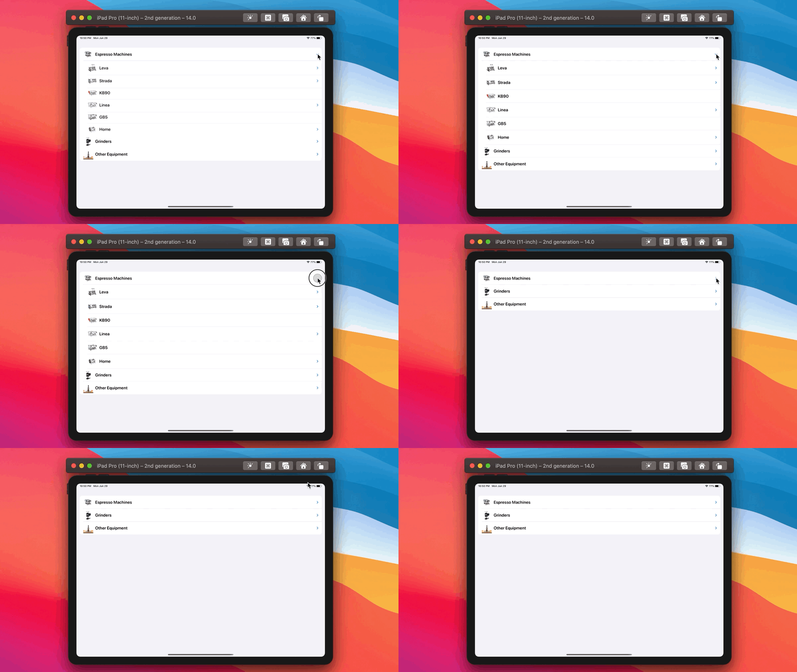
If you’ve read my previous tutorial on the expandable list view, you may know that I’m a big fan of La Marzocco. In that tutorial, I showed you how to create an expandable list view with inset group style.
Now let’s turn this expandable list into a two level navigation interface like the screenshot shown below:
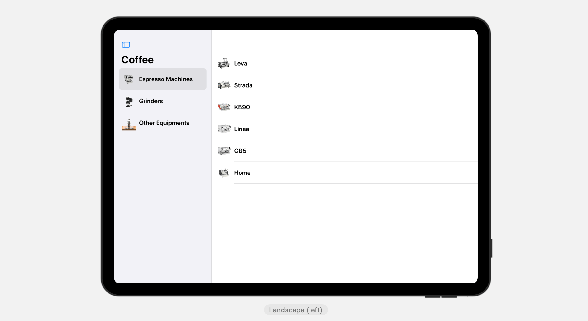
Before we create the split view, let’s begin with the data model. We create a struct to model a menu item:
struct MenuItem: Identifiable, Hashable {
    var id = UUID()
    var name: String
    var image: String
    var subMenuItems: [MenuItem]?
}
To make a nested list, the key here is to include a property that contains an optional array of children (i.e. subMenuItems). Note that the children are of the same type of its parent.
For the top level menu items, we can create an array of MenuItem like this:
let topMenuItems = [ MenuItem(name: "Espresso Machines", image: "linea-mini", subMenuItems: espressoMachineMenuItems),
                        MenuItem(name: "Grinders", image: "swift-mini", subMenuItems: grinderMenuItems),
                        MenuItem(name: "Other Equipments", image: "espresso-ep", subMenuItems: otherMenuItems)
                    ]
For each of the menu item, we specify the array of the sub-menu items. In case if there is no sub-menu item, you can omit the subMenuItems parameter or pass it a nil value. For the sub-menu items, we can define them like this:
// Sub-menu items for Espressco Machines
let espressoMachineMenuItems = [ MenuItem(name: "Leva", image: "leva-x", subMenuItems: [ MenuItem(name: "Leva X", image: "leva-x"), MenuItem(name: "Leva S", image: "leva-s") ]),
                                 MenuItem(name: "Strada", image: "strada-ep", subMenuItems: [ MenuItem(name: "Strada EP", image: "strada-ep"), MenuItem(name: "Strada AV", image: "strada-av"), MenuItem(name: "Strada MP", image: "strada-mp"), MenuItem(name: "Strada EE", image: "strada-ee") ]),
                                 MenuItem(name: "KB90", image: "kb90"),
                                 MenuItem(name: "Linea", image: "linea-pb-x", subMenuItems: [ MenuItem(name: "Linea PB X", image: "linea-pb-x"), MenuItem(name: "Linea PB", image: "linea-pb"), MenuItem(name: "Linea Classic", image: "linea-classic") ]),
                                 MenuItem(name: "GB5", image: "gb5"),
                                 MenuItem(name: "Home", image: "gs3", subMenuItems: [ MenuItem(name: "GS3", image: "gs3"), MenuItem(name: "Linea Mini", image: "linea-mini") ])
                                ]

// Sub-menu items for Grinder
let grinderMenuItems = [ MenuItem(name: "Swift", image: "swift"),
                         MenuItem(name: "Vulcano", image: "vulcano"),
                         MenuItem(name: "Swift Mini", image: "swift-mini"),
                         MenuItem(name: "Lux D", image: "lux-d")
                        ]

// Sub-menu items for other equipment
let otherMenuItems = [ MenuItem(name: "Espresso AV", image: "espresso-av"),
                         MenuItem(name: "Espresso EP", image: "espresso-ep"),
                         MenuItem(name: "Pour Over", image: "pourover"),
                         MenuItem(name: "Steam", image: "steam")
                        ]
To better organize the data model, we create a struct called CoffeeEquipmentModel like this:
struct CoffeeEquipmenModel {
    let mainMenuItems = {
        // Top menu items
        let topMenuItems = [ MenuItem(name: "Espresso Machines", image: "linea-mini", subMenuItems: espressoMachineMenuItems),
                                MenuItem(name: "Grinders", image: "swift-mini", subMenuItems: grinderMenuItems),
                                MenuItem(name: "Other Equipments", image: "espresso-ep", subMenuItems: otherMenuItems)
                            ]

        // Sub-menu items for Espresso Machines
        let espressoMachineMenuItems = [ MenuItem(name: "Leva", image: "leva-x", subMenuItems: [ MenuItem(name: "Leva X", image: "leva-x"), MenuItem(name: "Leva S", image: "leva-s") ]),
                                         MenuItem(name: "Strada", image: "strada-ep", subMenuItems: [ MenuItem(name: "Strada EP", image: "strada-ep"), MenuItem(name: "Strada AV", image: "strada-av"), MenuItem(name: "Strada MP", image: "strada-mp"), MenuItem(name: "Strada EE", image: "strada-ee") ]),
                                         MenuItem(name: "KB90", image: "kb90"),
                                         MenuItem(name: "Linea", image: "linea-pb-x", subMenuItems: [ MenuItem(name: "Linea PB X", image: "linea-pb-x"), MenuItem(name: "Linea PB", image: "linea-pb"), MenuItem(name: "Linea Classic", image: "linea-classic") ]),
                                         MenuItem(name: "GB5", image: "gb5"),
                                         MenuItem(name: "Home", image: "gs3", subMenuItems: [ MenuItem(name: "GS3", image: "gs3"), MenuItem(name: "Linea Mini", image: "linea-mini") ])
                                        ]

        // Sub-menu items for Grinder
        let grinderMenuItems = [ MenuItem(name: "Swift", image: "swift"),
                                 MenuItem(name: "Vulcano", image: "vulcano"),
                                 MenuItem(name: "Swift Mini", image: "swift-mini"),
                                 MenuItem(name: "Lux D", image: "lux-d")
                                ]

        // Sub-menu items for other equipment
        let otherMenuItems = [ MenuItem(name: "Espresso AV", image: "espresso-av"),
                                 MenuItem(name: "Espresso EP", image: "espresso-ep"),
                                 MenuItem(name: "Pour Over", image: "pourover"),
                                 MenuItem(name: "Steam", image: "steam")
                                ]

        return topMenuItems
    }()

    func subMenuItems(for id: MenuItem.ID) -> [MenuItem]? {
        guard let menuItem = mainMenuItems.first(where: { $0.id == id }) else {
            return nil
        }

        return menuItem.subMenuItems
    }

    func menuItem(for categoryID: MenuItem.ID, itemID: MenuItem.ID) -> MenuItem? {

        guard let subMenuItems = subMenuItems(for: categoryID) else {
            return nil
        }

        guard let menuItem = subMenuItems.first(where: { $0.id == itemID }) else {
            return nil
        }

        return menuItem
    }
}
The mainMenuItems array holds the sample menu items. Both subMenuItems and menuItem are helper methods for looking up a specific category or menu item.
Now that we’ve prepared the data model, let’s move onto the implementation of the navigation split view. Create a new file named TwoColumnSplitView.swift using the SwiftUI view template. Update the TwoColumnSplitView struct like this:
struct TwoColumnSplitView: View {

    @State private var selectedCategoryId: MenuItem.ID?

    private var dataModel = CoffeeEquipmenModel()

    var body: some View {
        NavigationSplitView {
            List(dataModel.mainMenuItems, selection: $selectedCategoryId) { item in
                HStack {
                    Image(item.image)
                        .resizable()
                        .scaledToFit()
                        .frame(width: 50, height: 50)
                    Text(item.name)
                        .font(.system(.title3, design: .rounded))
                        .bold()
                }
            }

            .navigationTitle("Coffee")

        } detail: {
            if let selectedCategoryId,
               let categoryItems = dataModel.subMenuItems(for: selectedCategoryId) {

                List(categoryItems) { item in
                    HStack {
                        Image(item.image)
                            .resizable()
                            .scaledToFit()
                            .frame(width: 50, height: 50)
                        Text(item.name)
                            .font(.system(.title3, design: .rounded))
                            .bold()
                    }
                }
                .listStyle(.plain)
                .navigationBarTitleDisplayMode(.inline)

            } else {
                Text("Please select a category")
            }
        }

    }
}
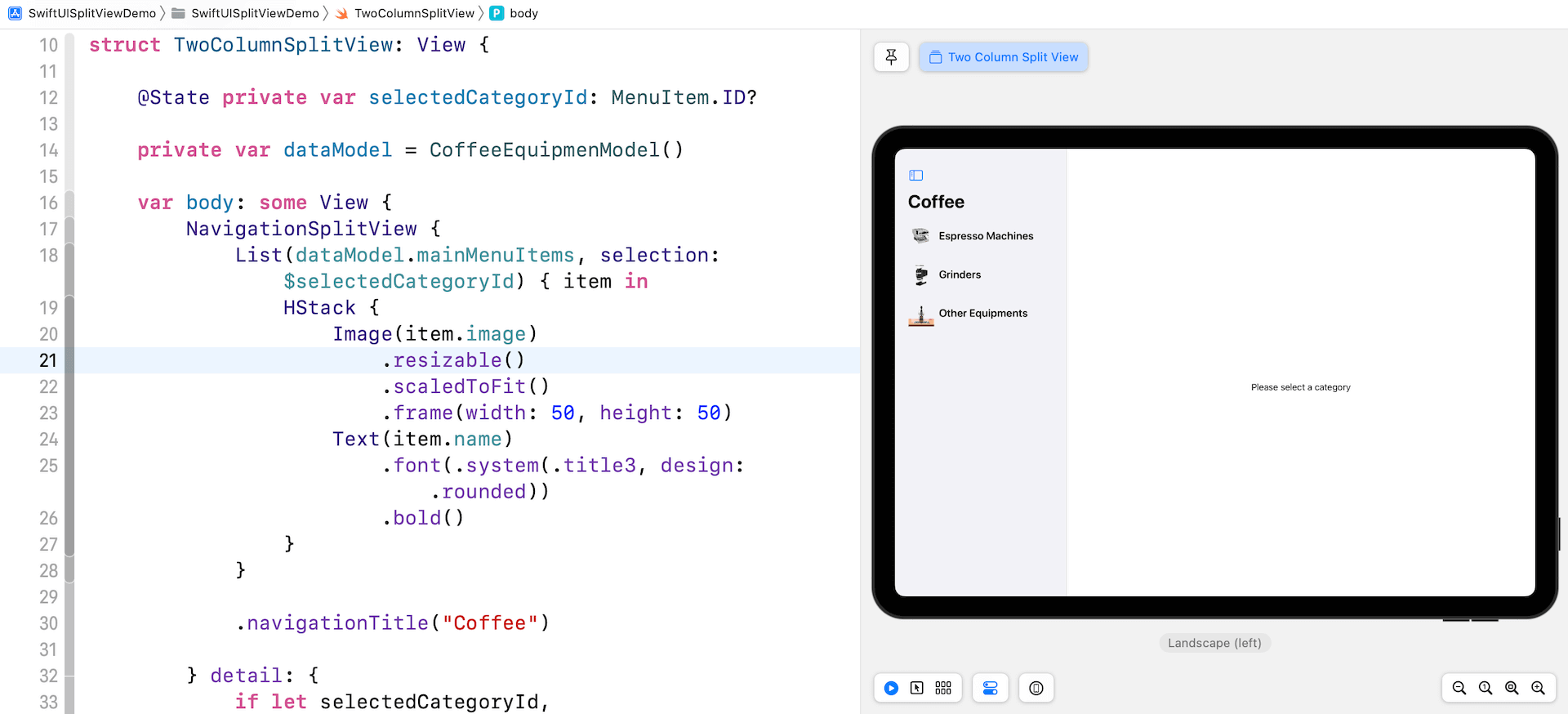
The first closure of NavigationSplitView presents the main menu item. We use a List view to loop through all mainMenuItems in the data model and display each of the menu items using a HStack view.
We also have a state variable named selectedCategoryId, which is used to hold the selected main menu item.
For the detail closure, this is where the submenu item is rendered. If a category is selected, we call the subMenuItems method to get the submenu items for that particular category. We then display the submenu items using List view. Conversely, if no category is selected, we display a text message instructing the user to choose a category.
Once you made the changes, you should see a two-column navigation UI in the Xcode preview.
Creating a Three-Column Navigation Interface
Now that we’ve created a two-column navigation interface, let’s further enhance it to provide users with a three-column navigation experience. The extra column is used for displaying the photo of the selected equipment.
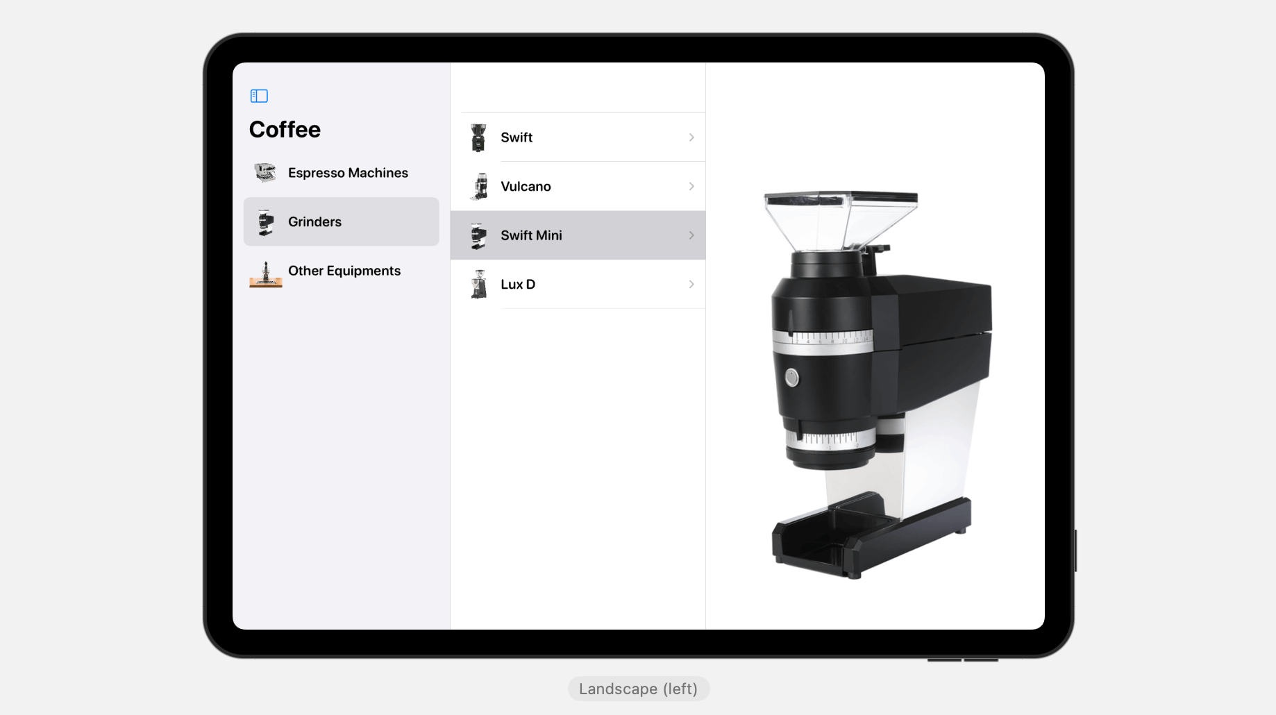
To convert the two-column navigation interface to three-column, we need to implement an additional parameter (i.e. content) for the NavigationSplitView. Let’s create a new view named ThreeColumnSplitView like this:
struct ThreeColumnSplitView: View {
    @State private var selectedCategoryId: MenuItem.ID?
    @State private var selectedItem: MenuItem?

    private var dataModel = CoffeeEquipmenModel()

    var body: some View {
        NavigationSplitView {

            List(dataModel.mainMenuItems, selection: $selectedCategoryId) { item in
                HStack {
                    Image(item.image)
                        .resizable()
                        .scaledToFit()
                        .frame(width: 50, height: 50)
                    Text(item.name)
                        .font(.system(.title3, design: .rounded))
                        .bold()
                }
            }

            .navigationTitle("Coffee")
        } content: {

            if let selectedCategoryId,
               let subMenuItems = dataModel.subMenuItems(for: selectedCategoryId) {
                List(subMenuItems, selection: $selectedItem) { item in
                    NavigationLink(value: item) {
                        HStack {
                            Image(item.image)
                                .resizable()
                                .scaledToFit()
                                .frame(width: 50, height: 50)
                            Text(item.name)
                                .font(.system(.title3, design: .rounded))
                                .bold()
                        }
                    }
                }
                .listStyle(.plain)
                .navigationBarTitleDisplayMode(.inline)

            } else {
                Text("Please select a menu item")
            }

        } detail: {
            if let selectedItem {
                Image(selectedItem.image)
                    .resizable()
                    .scaledToFit()
            } else {
                Text("Please select an item")
            }
        }

    }
}
Basically, the code in the content closure should be very similar to you. The content parameter is designed for displaying the submenu items. Thus, we use the List view to show the submenu items for the selected category.
When an item is selected in the submenu, the app shows the equipment photo. This is achieved by the code written in the detail closure.
After the code changes, the preview pane should show you a two-column layout.
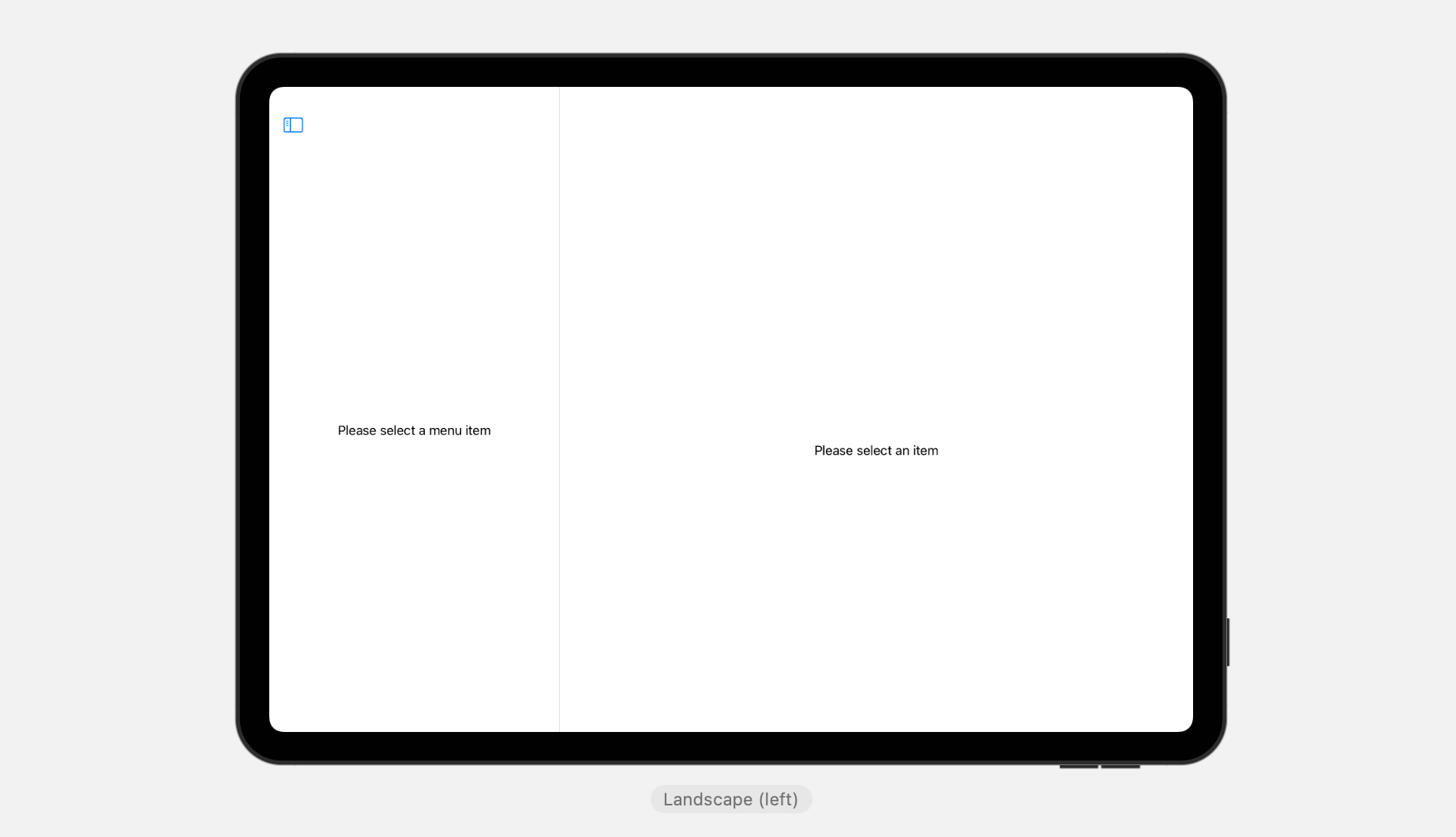
By default, the first column is hidden. You need to tap the menu button at the top-left corner to reveal it.
To control the visibility of the split view, you can declare a state variable of the type NavigationSplitViewVisibility and set its value to .all:
@State private var columnVisibility = NavigationSplitViewVisibility.allWhen instantiating the NavigationSplitView, it has an option parameter named columnVisibility. You can simply pass the binding of columnVisibility to control the visibility of the columns.
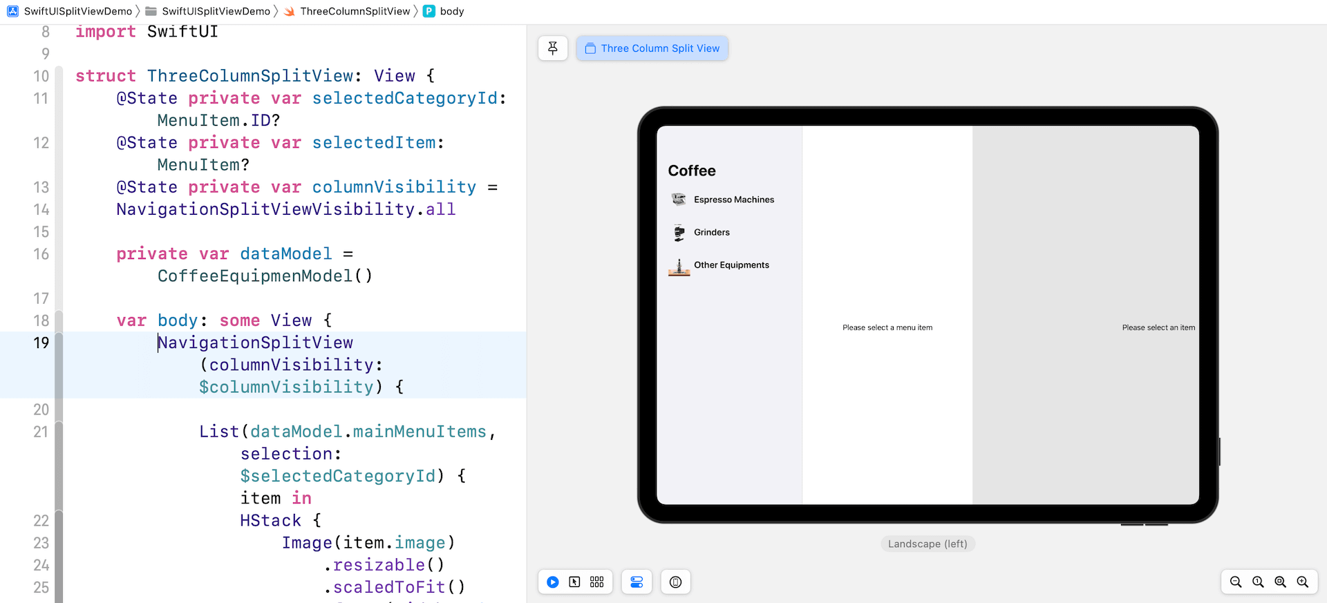
The NavigationSplitViewVisibility.all value tells iPadOS to display all the three columns. There are other options including:
.automatic– Use the default leading column visibility for the current device. This is the default setting..doubleColumn– Show the content column and detail area of a three-column navigation split view..detailOnly– Hide the leading two columns of a three-column split view. In other words, only the detail area shows.
Customizing the Style of Navigation Split Views
Have you tested the app in iPad Portrait? By default, the detail area takes up the whole screen when the iPad device is in portrait mode. So, when you bring up the main menu and submenu areas, the detail area is hidden behind these two leading columns.
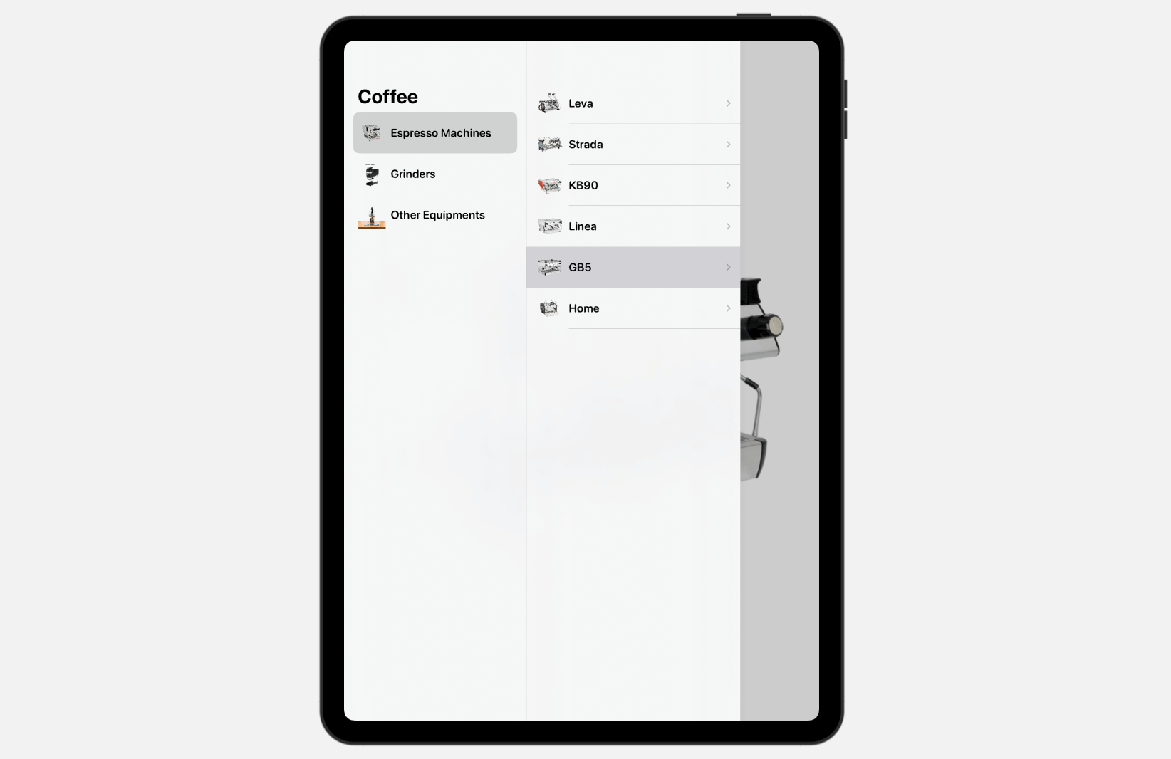
If you don’t like this style, you can change it by attaching the .navigationSplitViewStyle modifier to NavigationSplitView:
NavigationSplitView(columnVisibility: $columnVisibility) {
  .
  .
  .
}
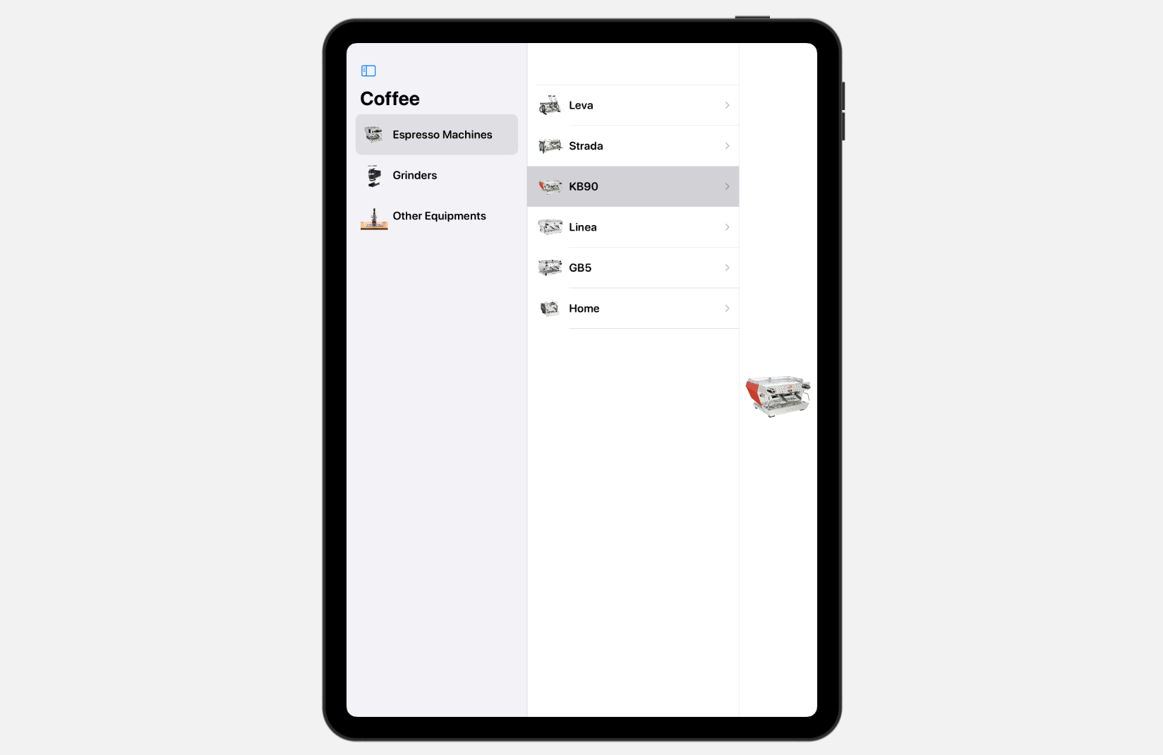
.navigationSplitViewStyle(.balanced)
The default value is set to .automatic. If you set the value to .balanced, it reduces the detail area such that the two leading columns can appear at the same time.
What’s Next
This tutorial gives you an introduction to NavigationSplitView in iOS 16. It’s very easy to create multi-column navigation experience for iPad users. Even if you develop apps for iPhone users, NavigationSplitView can adapt itself to fit the navigation experience on narrower screens. For example, when iPhone 13 Pro Max is in portrait mode, the split view shows a one-column navigation. If you rotate the device sideway, the split view changes to a multi-column layout.
Therefore, take some time to study this split view component and apply it to your app whenever this kind of UI makes sense.
For reference, if you want to learn more about NavigationSplitView, you can check out this WWDC video.
If you enjoy this article and want to dive deeper into SwiftUI, you may check out our Mastering SwiftUI book.


