Earlier this week, Apple kicked off WWDC 22. The SwiftUI framework continues to be one of the main focuses of the conference. As expected, Apple announced a new version of SwiftUI that comes along with iOS 16 and Xcode 14.
This update comes with tons of features to help developers build better apps and write less code. In this tutorial, let me give you an overview of what’s new in SwiftUI 4.0.
SwiftUI Charts
You no longer need to build your own chart library or rely on third-party libraries to create charts. The SwiftUI framework now comes with the Charts APIs. With this declarative framework, you can present animated charts with just a few lines of code.
In brief, you build SwiftUI Charts by defining what it calls Mark. Here is a quick example:
import SwiftUI
import Charts

struct ContentView: View {
    var body: some View {
        Chart {
            BarMark(
                x: .value("Day", "Monday"),
                y: .value("Steps", 6019)
            )

            BarMark(
                x: .value("Day", "Tuesday"),
                y: .value("Steps", 7200)
            )
        }
    }
}
Whether you want to create a bar chart or line chart, we start with the Chart view. Inside the chart, we define the bar marks to provide the chart data. The BarMark view is used for creating a bar chart. Each BarMark view accepts the x and y value. The x value is used for defining the chart data for x-axis. In the code above, the label of the x-axis is set to Day. The y axis shows the total number of steps.
If you input the code in Xcode 14, the preview automatically displays the bar chart with two vertical bars.
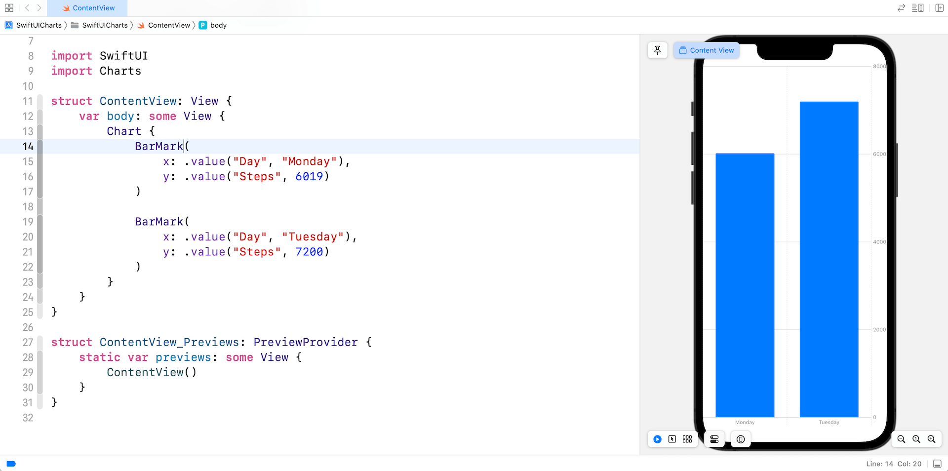
The code above shows you the simplest way to create a bar chart. However, instead of hardcoding the chart data, you usually use the Charts API with a collection of data. Here is an example:
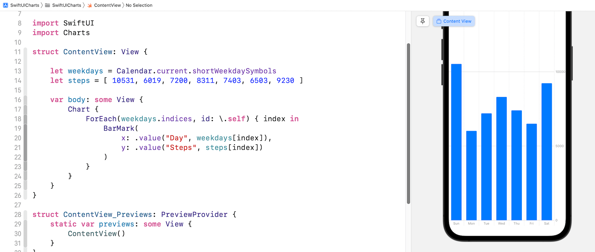
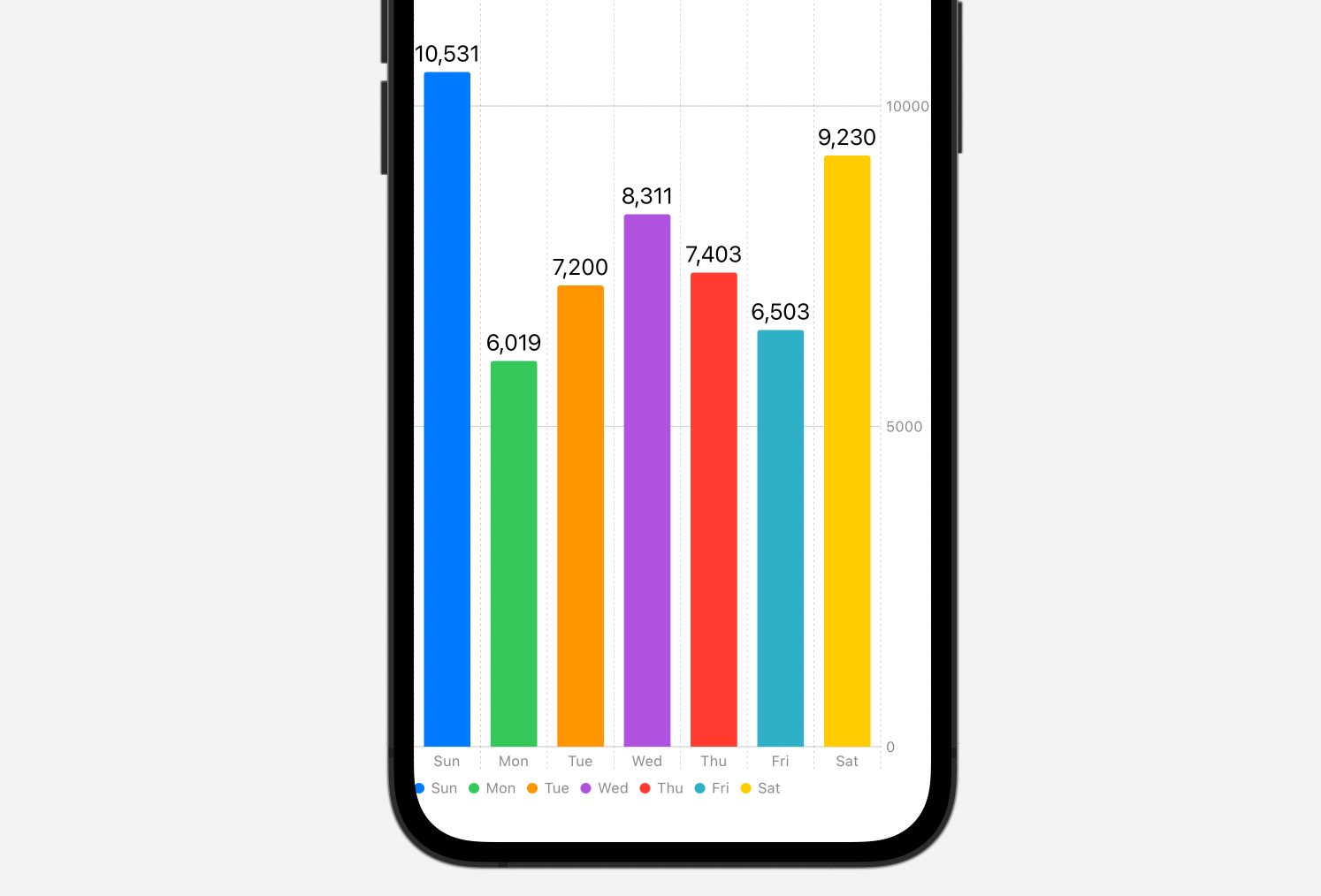
By default, the Charts API renders the bars in the same color. To display a different color for each of the bars, you can attach the foregroundStyle modifier to the BarMark view:
.foregroundStyle(by: .value("Day", weekdays[index]))To add an annotation to each bar, you use the annotation modifier like this:
.annotation {
    Text("\(steps[index])")
}
By making these changes, the bar chart becomes more visually appealing.
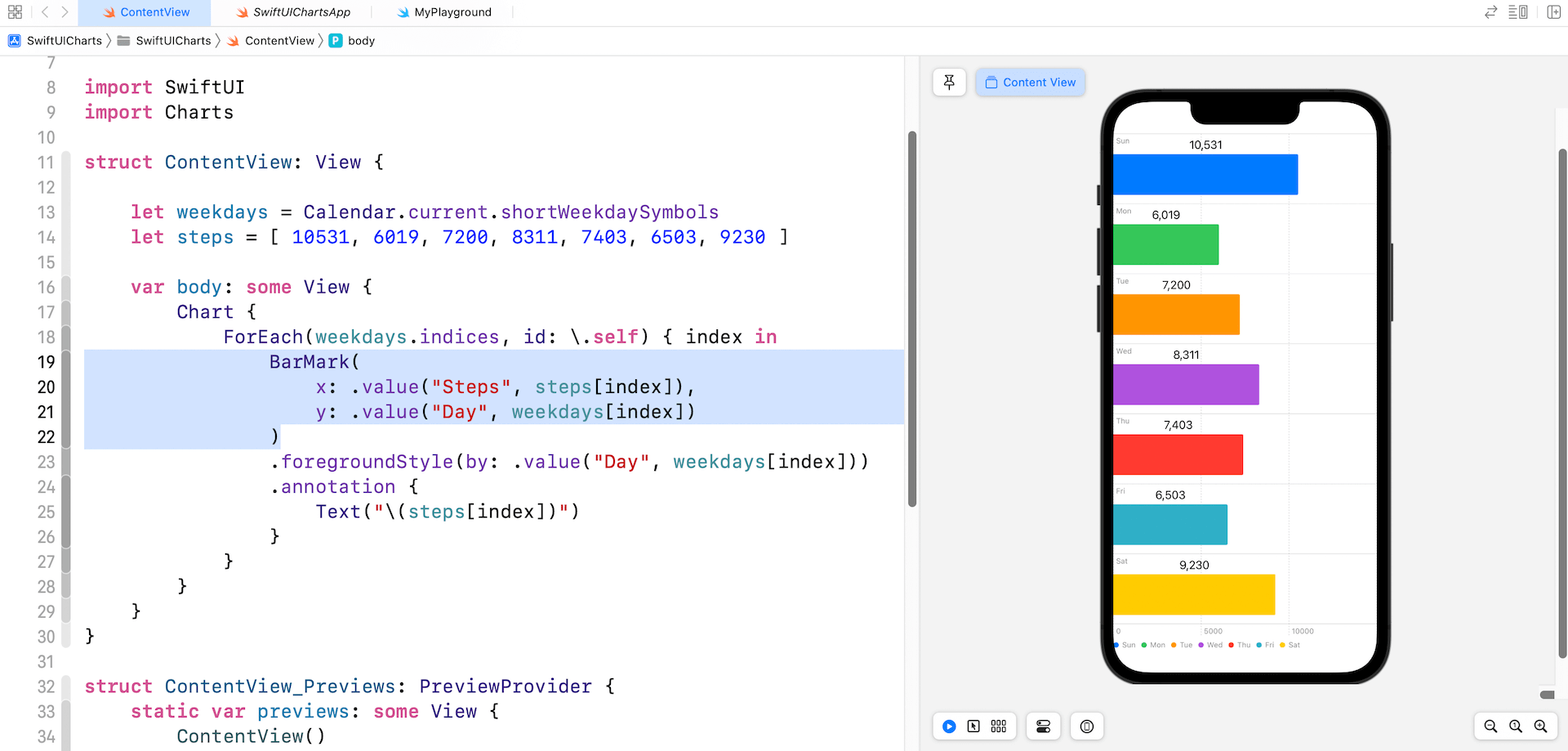
To create a horizontal bar chart, you can simply swap the values of x and y parameter of the BarMark view.
By changing the BarMark view to LineMark, you can turn a bar chart into a line chart.
Chart {
    ForEach(weekdays.indices, id: \.self) { index in
        LineMark(
            x: .value("Day", weekdays[index]),
            y: .value("Steps", steps[index])
        )
        .foregroundStyle(.purple)
        .lineStyle(StrokeStyle(lineWidth: 4.0))
    }
}
Optionally, you use foregroundStyle to change the color of the line chart. To change the line width, you can also attach the lineStyle modifier.
The Charts API is so flexible that you can overlay multiple charts in the same view. Here is an example.
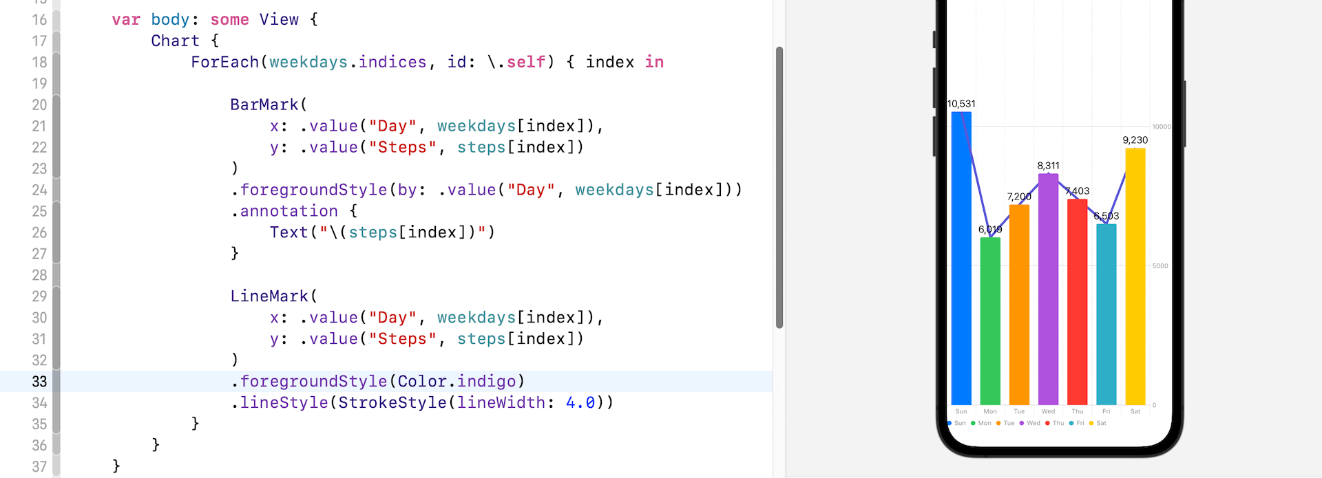
Other than BarMark and LineMark, the SwiftUI Charts framework also provides PointMark, AreaMark, RectangularMark, and RuleMark for creating different types of charts.
Resizable Bottom Sheet
Apple introduced UISheetPresentationController in iOS 15 for presenting an expandable bottom sheet. Unfortunately, this class is only available in UIKit. If we want to use it in SwiftUI, we have to write additional code to integrate the component into SwiftUI projects. This year, Swift comes with a new modifier called presentationDetents for presenting a resizable bottom sheet .
To use this modifier, you just need to place this modifier inside a sheet view. Here is an example:
struct BottomSheetDemo: View {
    @State private var showSheet = false

    var body: some View {
        VStack {
            Button("Show Bottom Sheet") {
                showSheet.toggle()
            }
            .buttonStyle(.borderedProminent)
            .sheet(isPresented: $showSheet) {
                Text("This is the resizable bottom sheet.")
                    .presentationDetents([.medium])
            }

            Spacer()
        }
    }
}
The presentationDetents modifier accepts a set of detents for the sheet. In the code above, we set the detent to .medium. This shows a bottom sheet that takes up about half of the screen.
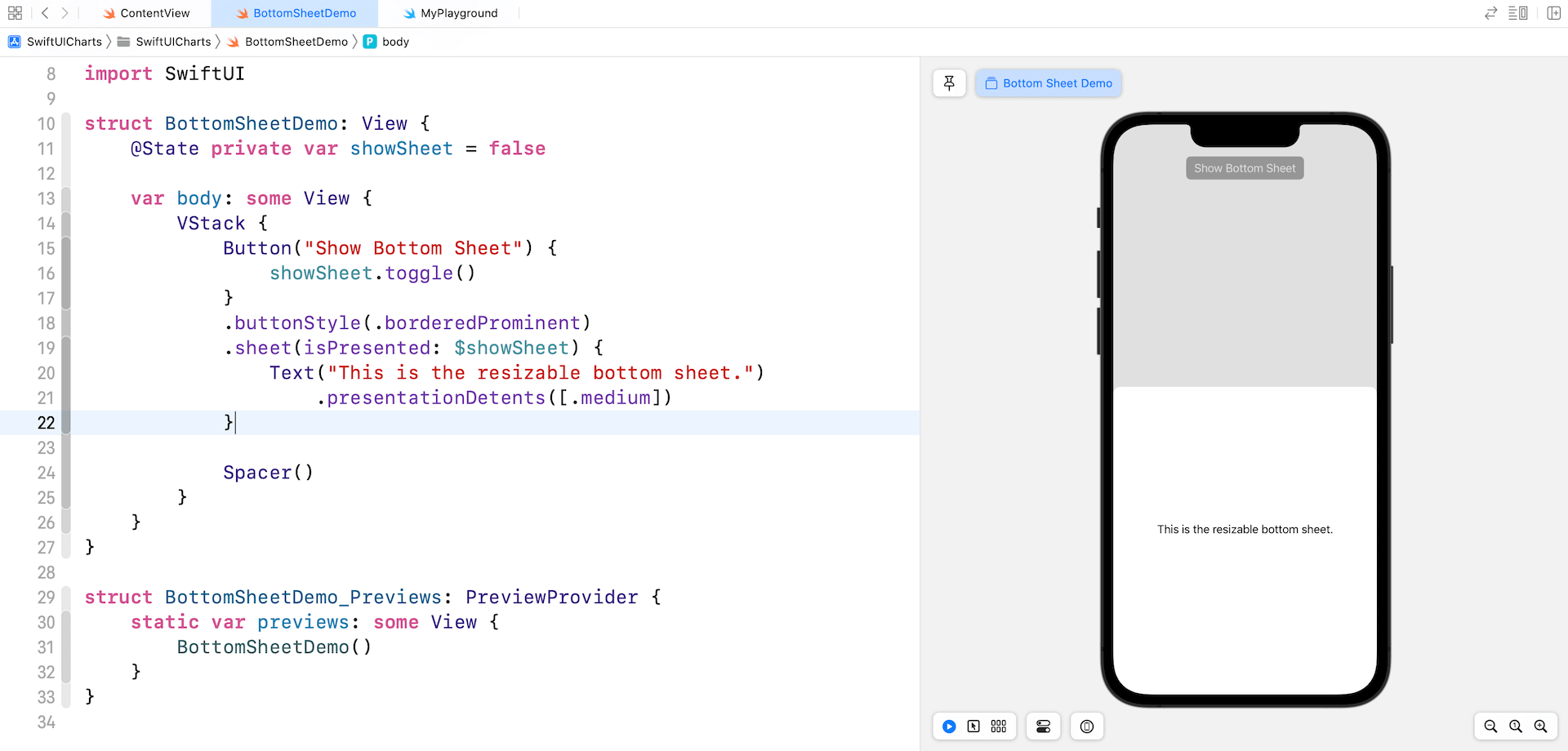
To make it resizable, you have to provide more than one detent for the presentationDetents modifier:
.presentationDetents([.medium, .large])You should now see a drag bar indicating that the sheet is resizable. If you want to hide the drag indicator, attach the presentationDragIndicator modifier and set it to .hidden:
.presentationDragIndicator(.hidden)Other than the preset detents such as .medium, you can create a custom detent using .height and .fraction. Here is another example:
.presentationDetents([.fraction(0.1), .medium, .large])When the bottom sheet first appears, it only takes up around 10% of the screen.
MultiDatePicker
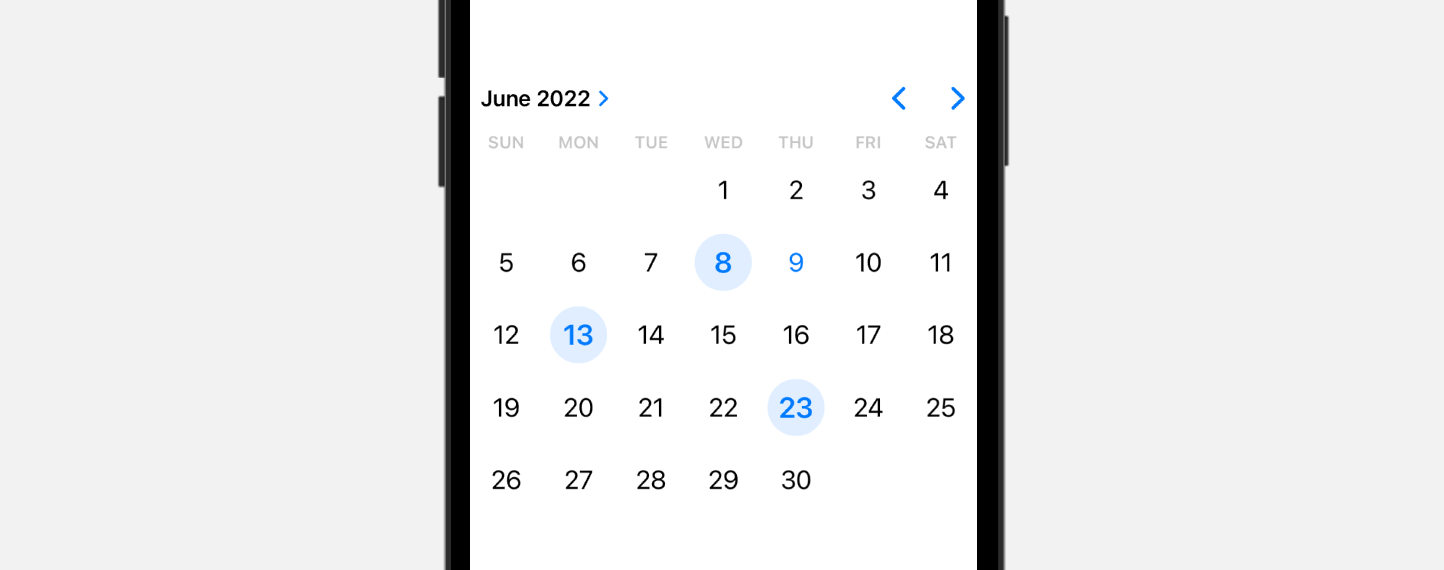
The latest version of SwiftUI comes with a new date picker for users to choose multiple dates. Below is the sample code:
struct MultiDatePickerDemo: View {

    @State private var selectedDates: Set<DateComponents> = []

    var body: some View {
        MultiDatePicker("Choose your preferred dates", selection: $selectedDates)
            .frame(height: 300)
    }
}
NavigationStack and NavigationSplitView
NavigationView is deprecated in iOS 16. Instead, it’s replaced by the new NavigationStack and NavigationSplitView. Prior to iOS 16, you use NavigationView to create a navigation-based interface:
NavigationView {
    List {
        ForEach(1...10, id: \.self) { index in
            NavigationLink(destination: Text("Item #\(index) detail")) {
                Text("Item #\(index)")
            }
        }
    }
    .listStyle(.plain)

    .navigationTitle("Navigation Demo")
}
By pair it with NavigationLink, you can create a push and pop navigation.
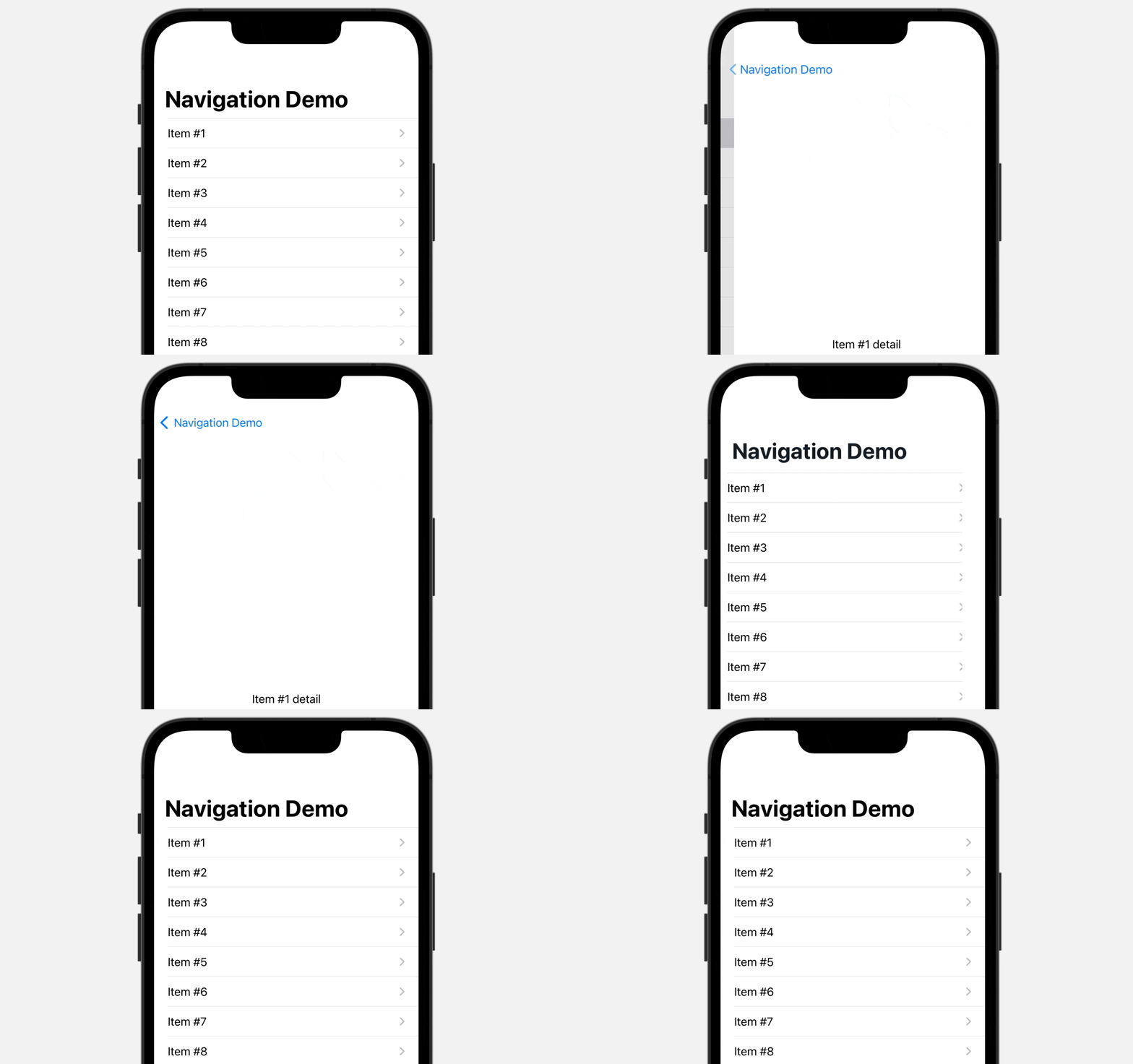
Since NavigationView is deprecated, iOS 16 provides a new view called NavigationStack. This new view allows developers to create the same type of navigation-based UIs. Here is an example:
NavigationStack {
    List {
        ForEach(1...10, id: \.self) { index in
            NavigationLink {
                Text("Item #\(index) Detail")
            } label: {
                Text("Item #\(index)")
            }
        }
    }
    .listStyle(.plain)

    .navigationTitle("Navigation Demo")
}
The code is very similar to the old approach, except that you use NavigationStack instead of NavigationView. So, what’s the enhancement of NavigationStack?
Let’s check out another example:
NavigationStack {
    List {
        NavigationLink(value: "Text Item") {
            Text("Text Item")
        }

        NavigationLink(value: Color.purple) {
            Text("Purple color")
        }
    }
    .listStyle(.plain)

    .navigationTitle("Navigation Demo")
    .navigationDestination(for: Color.self) { item in
        item.clipShape(Circle())
    }
    .navigationDestination(for: String.self) { item in
        Text("This is the detail view for \(item)")
    }
}
The list above is simplified with only two rows: Text item and Purple color. However, the underlying type of these two rows are not the same. One is a text item and the other is actually a Color object.
In iOS 16, the NavigationLink view is further improved. Instead of specifying the destination view, it can take a value that represents the destination. When this pairs with the new navigationDestination modifier, you can easily control the destination view. In the code above, we have two navigationDestination modifiers: one for the text item and the other is for the color object.
When a user selects a particular item in the navigation stack, SwiftUI checks the item type of the value of the navigation link. It then calls up the destination view which associates with that specific item type.
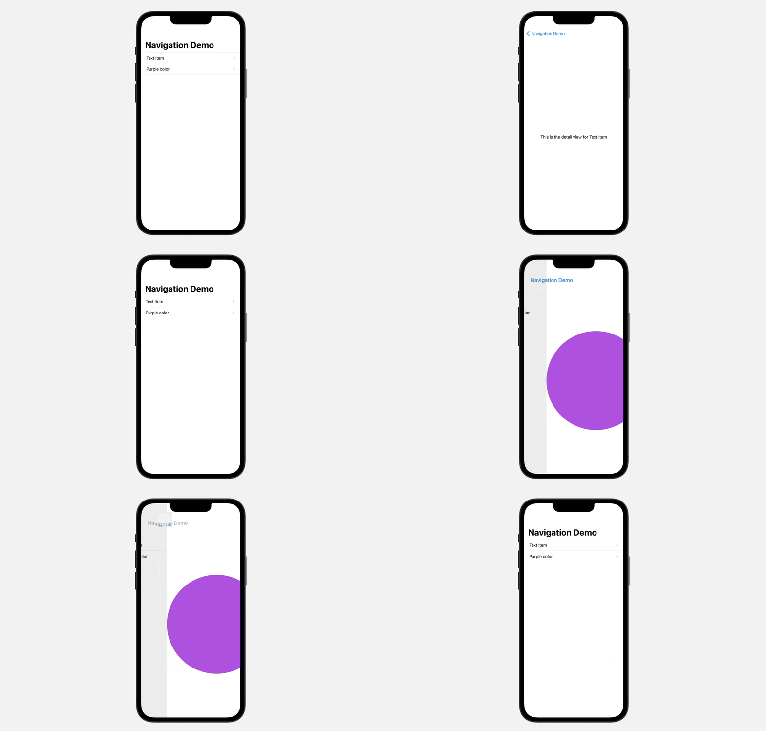
This is how the new NavigationStack works. That said, it’s just a quick overview of the new NavigationStack. With the new navigationDestination modifier, you can programmatically control the navigation. Say, you can create a button for you to jump directly to the main view from any detail views of the navigation stack. We will have another tutorial for that.
ShareLink for Data Sharing
iOS 16 introduces the ShareLink control for SwiftUI, allowing developers to present a share sheet. It’s very easy to use ShareLink. Here is an example:
struct ShareLinkDemo: View {
    private let url = URL(string: "https://www.appcoda.com")!

    var body: some View {
        ShareLink(item: url)
    }
}
Basically, you provide the ShareLink control with the item to share. This presents a default share button. When tapped, the app shows a share sheet.
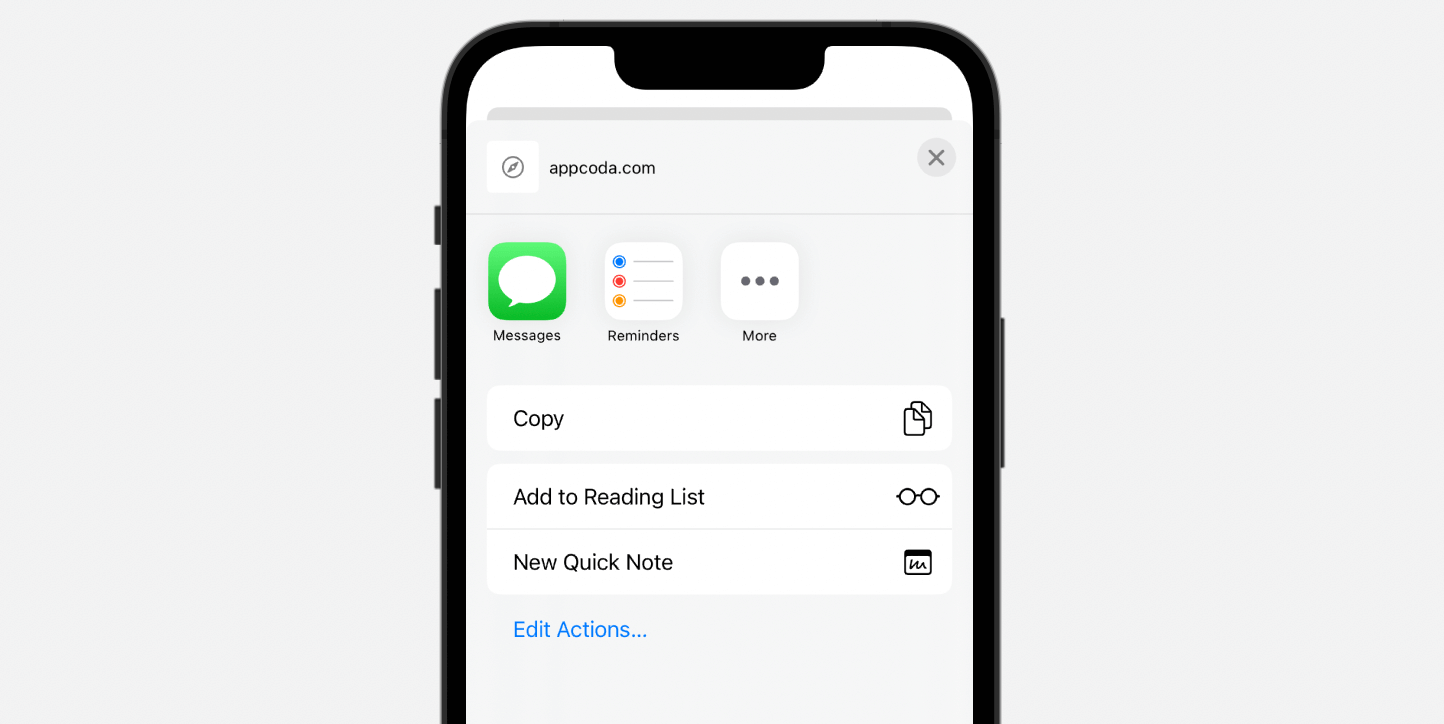
You can customize the share button by providing your own text and image like this:
ShareLink(item: url) {
    Label("Share", systemImage: "link.icloud")
}
To control the size of the share sheet, you can attach the presentationDetents modifier:
ShareLink(item: url) {
    Label("Share", systemImage: "link.icloud")
}
.presentationDetents([.medium, .large])
Table for iPadOS
A new Table container is introduced for iPadOS that makes it easier to present data in tabular form. Here is a sample code which shows a table with 3 columns:
struct TableViewDemo: View {

    private let members: [Staff] = [
        .init(name: "Vanessa Ramos", position: "Software Engineer", phone: "2349-233-323"),
        .init(name: "Margarita Vicente", position: "Senior Software Engineer", phone: "2332-333-423"),
        .init(name: "Yara Hale", position: "Development Manager", phone: "2532-293-623"),
        .init(name: "Carlo Tyson", position: "Business Analyst", phone: "2399-633-899"),
        .init(name: "Ashwin Denton", position: "Software Engineer", phone: "2741-333-623")
    ]

    var body: some View {
        Table(members) {
            TableColumn("Name", value: \.name)
            TableColumn("Position", value: \.position)
            TableColumn("Phone", value: \.phone)
        }
    }
}
You can create a Table from a collection of data (e.g. an array of Staff). For each column, you use TableColumn to specify the column name and values.

Table works great on iPadOS and macOS. The same table can be automatically rendered on iOS but only the first column is displayed.
Expandable Text Field
TextField on iOS 16 is greatly improved. You can now use the axis parameter to tell iOS whether the text field should be expanded. Here is an example:
Form {
    Section("Comment") {
        TextField("Please type your feedback here", text: $inputText, axis: .vertical)
            .lineLimit(5)
    }
}
The lineLimit modifier specifies the maximum number of lines allowed. The code above initially renders a single-line text field. As you type, it automatically expands but limits its size to 5 lines.

You can change the initial size of the text field by specifying a range in the lineLimit modifier like this:
Form {
    Section("Comment") {
        TextField("Please type your feedback here", text: $inputText, axis: .vertical)
            .lineLimit(3...5)
    }
}
In this case, iOS displays a text field displays a three-line text field by default.

Gauge
SwiftUI introduces a new view called Gauge for displaying progress. The simplest way to use Gauge is like this:
struct GaugeViewDemo: View {
    @State private var progress = 0.5

    var body: some View {
        Gauge(value: progress) {
            Text("Upload Status")
        }
    }
}
In the most basic form, a gauge has a default range from 0 to 1. If we set the value parameter to 0.5, SwiftUI renders a progress bar indicating the task is 50% complete.

Optionally, you can provide labels for the current, minimum, and maximum values:
Gauge(value: progress) {
    Text("Upload Status")
} currentValueLabel: {
    Text(progress.formatted(.percent))
} minimumValueLabel: {
    Text(0.formatted(.percent))
} maximumValueLabel: {
    Text(100.formatted(.percent))
}
Instead of using the default range, you can also specify a custom range like this:
Gauge(value: progress, in: 0...100) {
  .
  .
  .
}
The Gauge view provides a number of styles for you to customize. Other than the linear style as shown in the figure above, you can attach the gaugeStyle modifier to customize the style:

ViewThatFits
ViewThatFits is a great addition to SwiftUI allowing developers to create more flexible UI layouts. This is a special type of view that evaluates the available space and presents the most suitable view on screen.
Here is an example. We use ViewThatFits to define two possible layouts of the button group:
struct ButtonGroupView: View {
    var body: some View {
        ViewThatFits {
            VStack {
                Button(action: {}) {
                    Text("Buy")
                        .frame(maxWidth: .infinity)
                        .padding()
                }
                .buttonStyle(.borderedProminent)
                .padding(.horizontal)

                Button(action: {}) {
                    Text("Cancel")
                        .frame(maxWidth: .infinity)
                        .padding()
                }
                .tint(.gray)
                .buttonStyle(.borderedProminent)
                .padding(.horizontal)
            }
            .frame(maxHeight: 200)


            HStack {
                Button(action: {}) {
                    Text("Buy")
                        .frame(maxWidth: .infinity)
                        .padding()
                }
                .buttonStyle(.borderedProminent)
                .padding(.leading)

                Button(action: {}) {
                    Text("Cancel")
                        .frame(maxWidth: .infinity)
                        .padding()
                }
                .tint(.gray)
                .buttonStyle(.borderedProminent)
                .padding(.trailing)
            }
            .frame(maxHeight: 100)

        }
    }
}
One group of the buttons is aligned vertically using the VStack view. The other group of buttons is aligned horizontally. The maxHeight of the vertical group is set to 200, while that of the horizontal group is set to 100.
What ViewThatFits does is that it evaluates the height of the given space and presents the best fit view on screen. Say, you set the frame height to 100 like this:
ButtonGroupView()
    .frame(height: 100)
ViewThatFits determines that it’s best to present the horizontally-aligned button group. Let’s say, you change the frame’s height to 150. The ViewThatFits view presents the vertical button group.

Gradient and Shadow
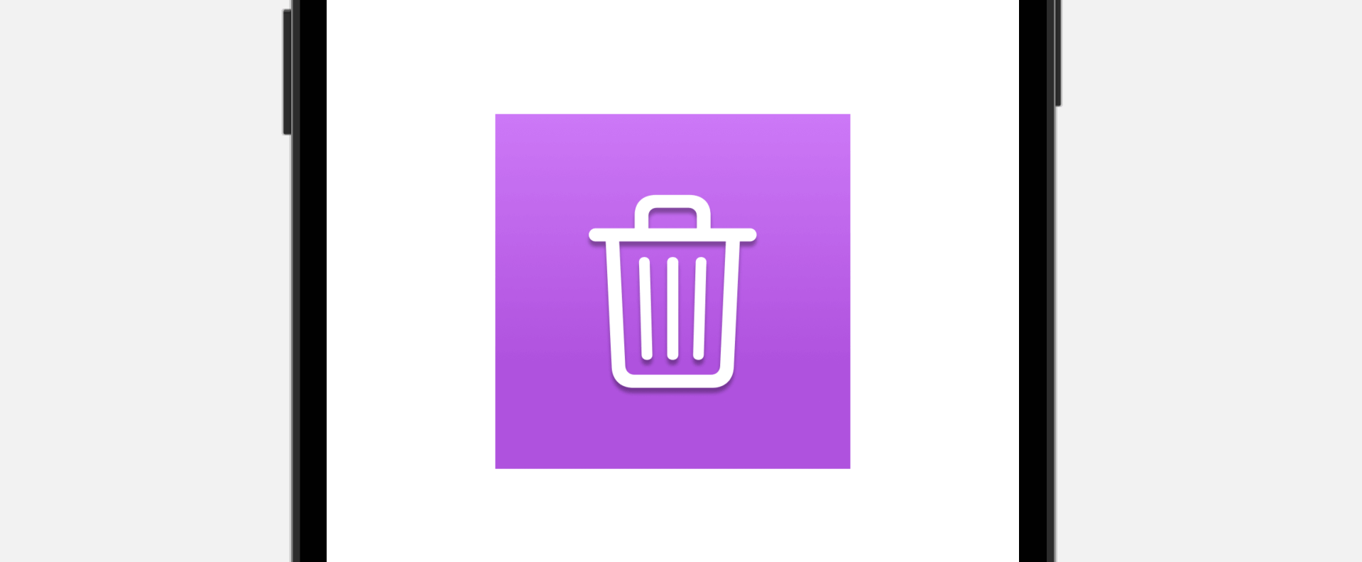
The new version of SwiftUI lets you easily add linear gradient. Simply add the gradient modifier to Color and SwiftUI automatically generates the gradients. Here is an example:
Image(systemName: "trash")
    .frame(width: 100, height: 100)
    .background(in: Rectangle())
    .backgroundStyle(.purple.gradient)
    .foregroundStyle(.white.shadow(.drop(radius: 1, y: 3.0)))
    .font(.system(size: 50))
You can also use the shadow modifier to apply shadow effect. Here is the line of code for adding a drop shadow style:
.foregroundStyle(.white.shadow(.drop(radius: 1, y: 3.0)))Grid API
SwiftUI 4.0 introduces a new Grid API for composing grid-based layout. You can arrange the same layout by using VStack and HStact. The Grid view, however, makes it a lot easier.
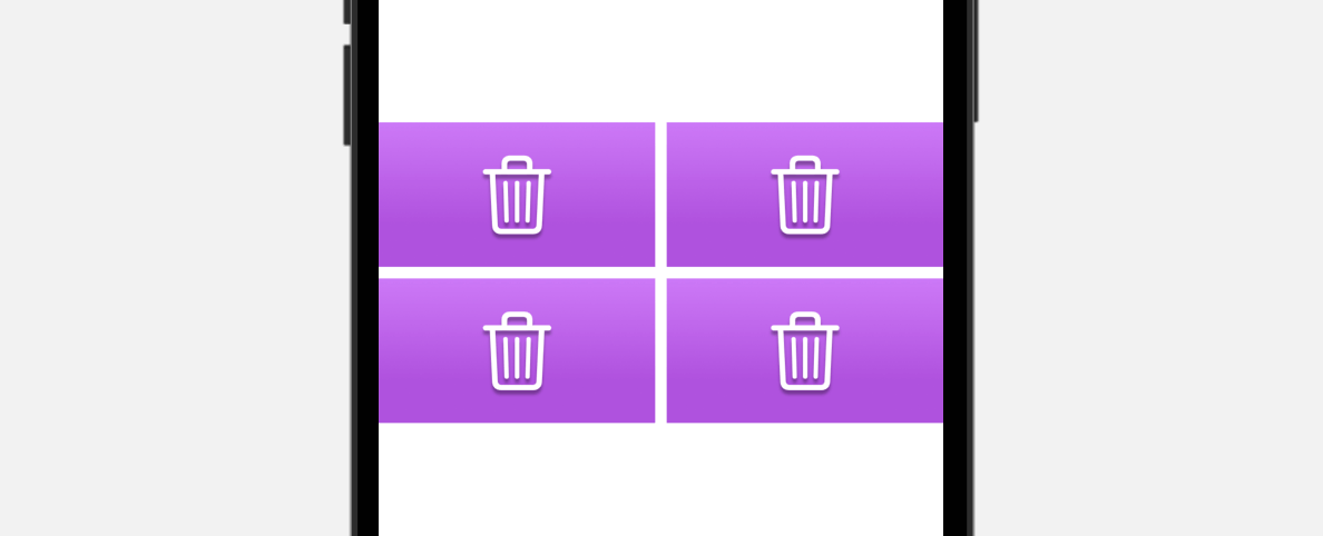
To create a 2×2 grid, you can write the code like this:
Grid {
    GridRow {
        IconView(systemName: "trash")
        IconView(systemName: "trash")
    }

    GridRow {
        IconView(systemName: "trash")
        IconView(systemName: "trash")
    }
}
Inside the Grid view, it’s a collection of GridRow that embeds the grid cells.
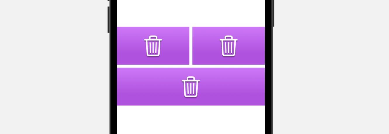
Let’s say, the second row presents a single icon view and you want it to span across two columns. You can attach the gridCellColumns modifier and set the value to 2:
Grid {
    GridRow {
        IconView(systemName: "trash")
        IconView(systemName: "trash")
    }

    GridRow {
        IconView(systemName: "trash")
            .gridCellColumns(2)
    }
}
The Grid view can be nested to compose more complex layouts like the one displayed below:
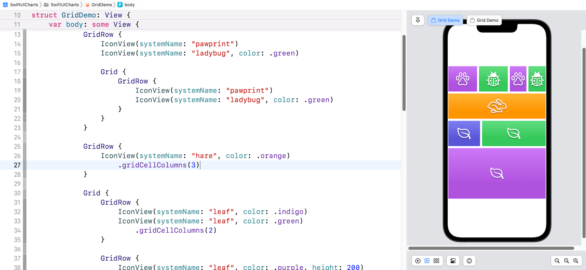
AnyLayout and Layout Protocol
The new version of SwiftUI provides AnyLayout and the Layout protocol for developers to create customized and complex layouts. AnyLayout is a type-erased instance of the layout protocol. You can use AnyLayout to create a dynamic layout that responds to users’ interactions or environment changes.
For instance, your app initially arranges two images vertically using VStack. When a user taps the stack view, it changes to a horizontal stack. With AnyLayout, you can implement the layout like this:
struct AnyLayoutDemo: View {

    @State private var changeLayout = false

    var body: some View {
        let layout = changeLayout ? AnyLayout(HStack(spacing: 0)) : AnyLayout(VStack(spacing: 0))


        layout {
            Image("macbook-1")
                .resizable()
                .scaledToFill()
                .frame(maxWidth: 300, maxHeight: 200)
                .clipped()

            Image("macbook-2")
                .resizable()
                .scaledToFill()
                .frame(maxWidth: 300, maxHeight: 200)
                .clipped()

        }
        .animation(.default, value: changeLayout)
        .onTapGesture {
            changeLayout.toggle()
        }

    }
}
We can define a layout variable to hold an instance of AnyLayout. Depending on the value of changeLayout, this layout changes between horizontal and vertical layouts.
By attaching the animation to the layout, the layout change will be animated.
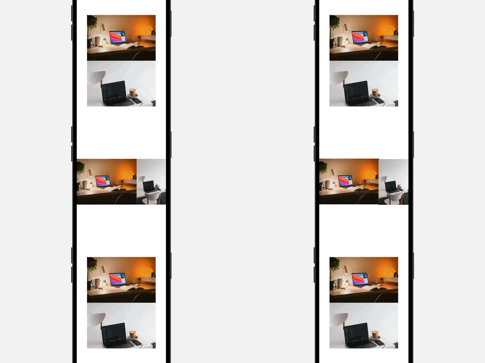
The demo lets users change the layout by tapping the stack view. In some applications, you may want to change the layout based on the device’s orientation and screen size. In this case, you can capture the orientation change by using the .horizontalSizeClass variable:
@Environment(\.horizontalSizeClass) var horizontalSizeClassAnd then you update the layout variable like this:
let layout = horizontalSizeClass == .regular ? AnyLayout(HStack(spacing: 0)) : AnyLayout(VStack(spacing: 0))Say, for example, you rotate an iPhone 13 Pro Max to landscape, the layout changes to horizontally stack view.

In most cases, we use SwiftUI’s built-in layout containers like HStack and VStack to compose layouts. What if those layout containers are not good enough for arranging the type of layouts you need? The Layout protocol introduced in iOS 16 allows you to define your own custom layout. This is a more complex topic, so we will discuss this new protocol in another tutorial.
Summary
This year, Apple once again delivered tons of great features for the SwiftUI framework. The Charts API, the revamp of navigation view, and the introduction of AnyLayout will definitely help you build more elegant and engaging UIs. I’m still exploring the new APIs of SwiftUI. If I miss any great updates, please do leave a comment below and let me know.
Note: We are updating our Mastering SwiftUI book for iOS 16. If you want to start learning SwiftUI, check out the book here. You will receive a free update later this year.


