

With SwiftUI, you can easily draw a border around a button or text (and it actually works for all views) using the border modifier. Say, for example, you want to create a button like this:
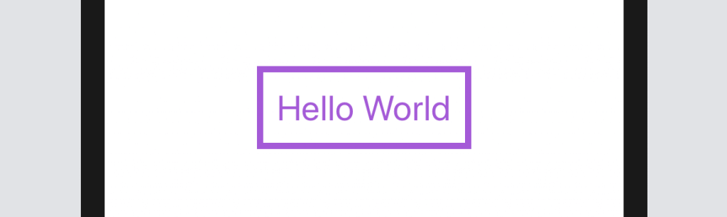
We can apply the border modifier on a button object to create a button with a coloured border:
Button(action: {
    print("Hello button tapped!")
}) {
    Text("Hello World")
        .fontWeight(.bold)
        .font(.title)
        .foregroundColor(.purple)
        .padding()
        .border(Color.purple, width: 5)
}
But what if your designer wants you to create a rounded border button like this? How can you do that?
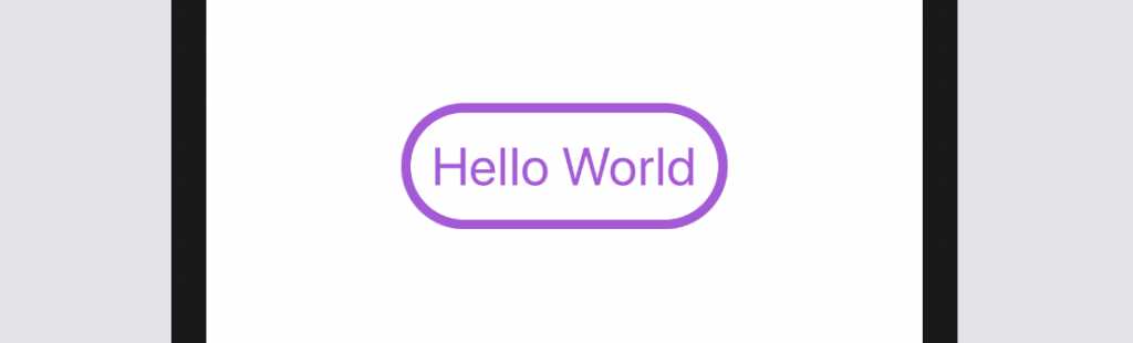
Before the release of Xcode 11 beta 6, you can use the border modifier and pass it with the corner radius:
.border(Color.purple, width: 5, cornerRadius: 20)However, the latest beta of Xcode 11 has deprecated the function call. To create a border with rounded corners, you can draw a rounded rectangle and overlay on the button like this:
Button(action: {
    print("Hello button tapped!")
}) {
    Text("Hello World")
        .fontWeight(.bold)
        .font(.title)
        .foregroundColor(.purple)
        .padding()
        .overlay(
            RoundedRectangle(cornerRadius: 20)
                .stroke(Color.purple, lineWidth: 5)
        )
}
In the code, we use a RoundedRectangle and its stroke modifier to create the rounded border. You can modify the color and line width to adjust its appearance.
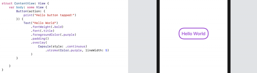
To create a button with different styles, you can just use another shape object to draw the border. Say, you can replace the RoundedRectangle with Capsule to create a border like this:
By specifying your own StrokeStyle, this will enable you to create a button with dash border:
Button(action: {
    print("Hello button tapped!")
}) {
    Text("Hello World")
        .fontWeight(.bold)
        .font(.title)
        .foregroundColor(.purple)
        .padding()
        .overlay(
            Capsule(style: .continuous)
                .stroke(Color.purple, style: StrokeStyle(lineWidth: 5, dash: [10]))
        )
}
If you want to learn more about SwiftUI buttons, please check out our beginner guide here.


