

Whether you’re creating a social media app or a productivity tool, the tab bar interface can enhance the user experience by making it more intuitive and user-friendly. With SwiftUI’s TabView, creating a seamless and customizable tab interface has never been easier.
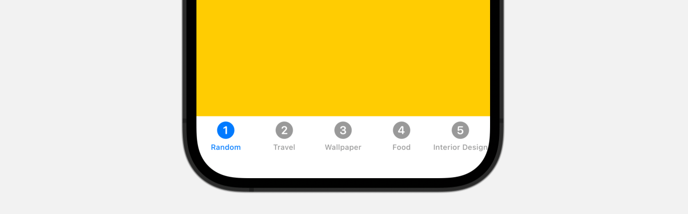
By default, iOS displays the tab bar in its standard form, allowing users to quickly switch between different app functions with ease. However, as a developer, you probably want to customize the tab bar to fit the specific needs of your app.
In this tutorial, you’ll learn how to create a scrollable and animated tab bar which supports infinite tab items using SwiftUI. Take a look at the end result below to get a glimpse of what you’ll be able to achieve by the end of the tutorial.
Introducing Tab View and Tab Bar
If you haven’t used TabView before, let’s have a quick walk through. To create a tab view, you just need to use TabView and embed the child views inside. For each of the child views, you apply the tabItem modifier to specify the item description. Here is an example:
struct ContentView: View {
    let colors: [Color] = [ .yellow, .blue, .green, .indigo, .brown ]
    let tabbarItems = [ "Random", "Travel", "Wallpaper", "Food", "Interior Design" ]

    var body: some View {
        TabView {
            ForEach(colors.indices, id: \.self) { index in
                colors[index]
                    .frame(maxWidth: .infinity, maxHeight: .infinity)
                    .tag(index)
                    .tabItem {
                        Image(systemName: "\(index + 1).circle")
                        Text(tabbarItems[index])
                    }
            }
        }
    }
}
The code above creates a simple tab view with 5 tab items. You use the Image view to display the tab icon. If you’ve written the code in Xcode, you should see a tab bar in the preview.
The TabView has another init method for this purpose. The method requires a state variable which contains the tag value of the tab.
TabView(selection: $selectedIndex)As an example, declare the following state variable in ContentView:
@State private var selectedIndex = 0Now if you change the value of selectedIndex, the tab view will automatically switch to the corresponding tab. You may modify the code like this to test it out:
TabView(selection: $selectedIndex) {
   .
   .
   .
}
.onAppear {
    selectedIndex = 2
}
When the tab view appears, the third tab is automatically selected.
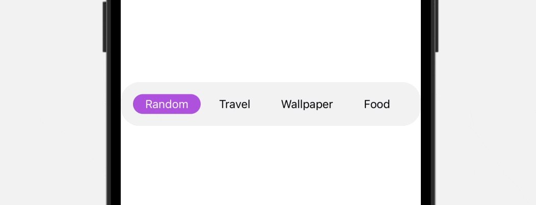
Building a Custom Scrollable Tab Bar
As you can see in the final result above, the tab bar is scrollable, which is particularly useful when you need to accomodate more than 5 items. To build this custom tab bar, we will use both ScrollView and ScrollViewReader to create our own view.
Let’s name our tab bar view TabBarView and create it like this:
struct TabBarView: View {
var tabbarItems: [String]
@State var selectedIndex = 0
var body: some View {
ScrollViewReader { scrollView in
ScrollView(.horizontal, showsIndicators: false) {
HStack {
ForEach(tabbarItems.indices, id: \.self) { index in
Text(tabbarItems[index])
.font(.subheadline)
.padding(.horizontal)
.padding(.vertical, 4)
.foregroundColor(selectedIndex == index ? .white : .black)
.background(Capsule().foregroundColor(selectedIndex == index ? .purple : .clear))
.onTapGesture {
withAnimation(.easeInOut) {
selectedIndex = index
}
}
}
}
}
.padding()
.background(Color(.systemGray6))
.cornerRadius(25)
}
}
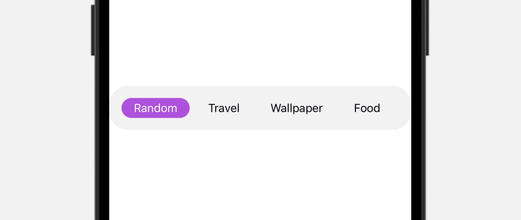
}This custom tab view accepts an array of tab bar items. For demo purposes, we’re using a String array. However, in real-world applications, you may want to create your own custom type for the tab item.
To enable scrolling within the tab bar, we’ve embedded all of the tab items in a scroll view. Additionally, we’ve wrapped the scroll view with a scroll view reader to ensure that the selected tab item is always visible.
When a specific tab item is selected, we update the selectedIndex variable to reflect the selected index. This enables us to highlight the active tab item and provide feedback to the user.
To preview this custom tab bar, you can add the TabBarView to the preview like this:
struct ContentView_Previews: PreviewProvider {
    static var previews: some View {
        ContentView()

        TabBarView(tabbarItems: [ "Random", "Travel", "Wallpaper", "Food", "Interior Design" ]).previewDisplayName("TabBarView")
    }
}
Right now, the custom tab bar works pretty good. However, you may notice that you need to manually scroll the tab bar in order to reveal the last item. To fix this issue, you can attach the following code to the ScrollView:
.onChange(of: selectedIndex) { index in
    withAnimation {
        scrollView.scrollTo(index, anchor: .center)
    }
}
When the selected index is updated, we call the scrollTo method to move the scroll view.
Transform the Animation with matchedGeometryEffect
You’ve built a dynamic and scrollable tab bar, but wouldn’t it be great if we can make the animation even better? Currently, the tab bar uses a fade animation when switching between tab items. By incorporating matchedGeometryEffect into the tab bar, you can create a much smoother and visually appealing animation. Let’s see how to implement it.
First, let’s create a new struct called TabbarItem for the tab bar item like this:
struct TabbarItem: View {
    var name: String
    var isActive: Bool = false
    let namespace: Namespace.ID

    var body: some View {
        if isActive {
            Text(name)
                .font(.subheadline)
                .padding(.horizontal)
                .padding(.vertical, 4)
                .foregroundColor(.white)
                .background(Capsule().foregroundColor(.purple))
                .matchedGeometryEffect(id: "highlightmenuitem", in: namespace)
        } else {
            Text(name)
                .font(.subheadline)
                .padding(.horizontal)
                .padding(.vertical, 4)
                .foregroundColor(.black)
        }

    }
}
With matchedGeometryEffect, all you need is describe the appearance of two views. The modifier will then compute the difference between those two views and automatically animates the size/position changes. So in the code above, we highlight the tab item in purple when it is active. Otherwise, we display a normal text style.
In the TabBarView, declare a new namespace variable:
@Namespace private var menuItemTransitionAnd then, rewrite the code of the ForEach loop like this:
ForEach(tabbarItems.indices, id: \.self) { index in

    TabbarItem(name: tabbarItems[index], isActive: selectedIndex == index, namespace: menuItemTransition)
        .onTapGesture {
            withAnimation(.easeInOut) {
                selectedIndex = index
            }
        }
}
Once you made the change, you should notice a much better animation when switching between tab items.
Using the Custom Tab Bar
We have to make a minor change in the TabBarView before we can apply it to our ContentView. In TabBarView, modify the state variable to a binding variable like this:
@Binding var selectedIndex: IntNow you’re ready to use this custom tab bar in other views. In ContentView, update the body part like this:
ZStack(alignment: .bottom) {
TabView(selection: $selectedIndex) {
ForEach(colors.indices, id: \.self) { index in
colors[index]
.frame(maxWidth: .infinity, maxHeight: .infinity)
.tag(index)
.ignoresSafeArea()
}
}
.ignoresSafeArea()
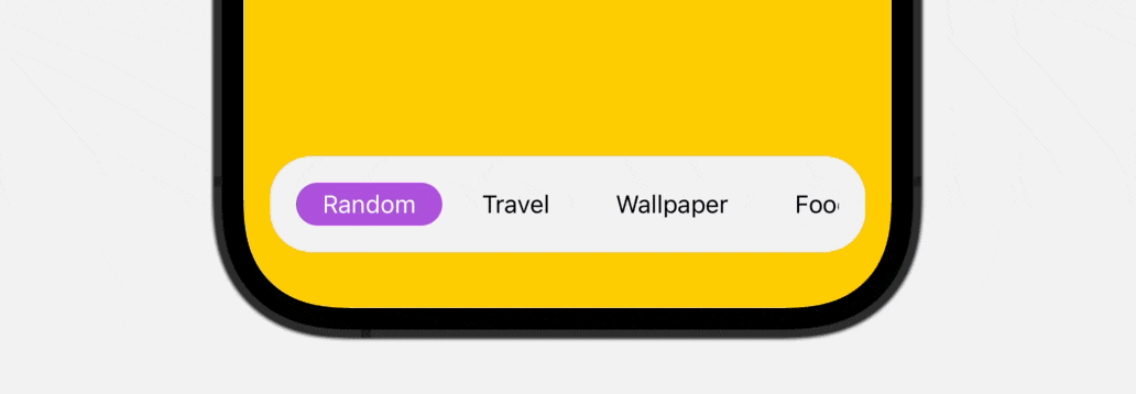
TabBarView(tabbarItems: tabbarItems, selectedIndex: $selectedIndex)
.padding(.horizontal)
}Incorporating the custom tab bar into your app is a straightforward process. By wrapping the TabView in a ZStack and overlaying the TabBarView on top of it, you can easily integrate the tab bar into the tab UI.
To make the project run smoothly, you also need to update the preview struct like this:
struct ContentView_Previews: PreviewProvider {
    static var previews: some View {
        ContentView()

        TabBarView(tabbarItems: [ "Random", "Travel", "Wallpaper", "Food", "Interior Design" ], selectedIndex: .constant(0)).previewDisplayName("TabBarView")
    }
}
Now you’re ready to test the tab UI.
Wrap Up
The tab bar interface is an essential component of many popular mobile apps, providing users with quick and easy access to various app functions. While the standard tab bar generally suffices for most scenarios, there may be occasions when you want to create a custom tab bar to enhance the user experience.
In this tutorial, you’ve learned how to create a dynamic and scrollable tab bar that can accommodate an infinite number of tab items. By incorporating matchedGeometryEffect, you can also take your tab bar’s animation to the next level. With the techniques covered, you’ll be able to design a seamless and intuitive custom tab bar that fits your app’s specific needs.
If you want to dive deeper into SwiftUI, you can check out our Mastering SwiftUI book.


