If you’ve been programming with SwiftUI before, you probably got a taste of building gestures with SwiftUI. You use the onTapGesture modifier to handle a user’s touch and provide a corresponding response. In this tutorial, let’s dive deeper to see how we work with various types of gestures in SwiftUI.
The framework provides several built-in gestures such as the tap gesture we have used before. Other than that, DragGesture, MagnificationGesture, and LongPressGesture are some of the ready-to-use gestures. We will looking into a couple of them and see how we work with gestures in SwiftUI. On top of that, you will learn how to build a generic view that supports the drag gesture.
Using the Gesture Modifier
To recognize a particular gesture using the SwiftUI framework, all you need to do is attach a gesture recognizer to a view using the .gesture modifier. Here is a sample code snippet which attaches the TapGesture using the .gesture modifier:
var body: some View {
    Image(systemName: "star.circle.fill")
        .font(.system(size: 200))
        .foregroundColor(.green)
        .gesture(
            TapGesture()
                .onEnded({
                    print("Tapped!")
                })
        )
}
If you want to try out the code, create a new project using the Single View Application template and make sure you select SwiftUI as the UI option. Then paste the code in ContentView.swift.
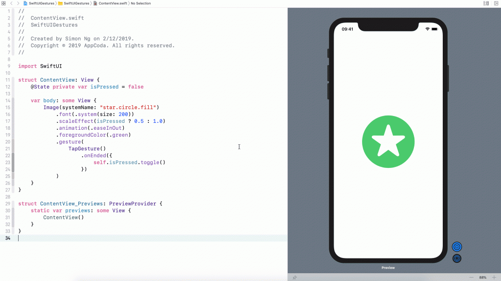
By modifying the code above a bit and introducing a state variable, we can create a simple scale animation when the star image is tapped. Here is the updated code:
struct ContentView: View {
    @State private var isPressed = false

    var body: some View {
        Image(systemName: "star.circle.fill")
            .font(.system(size: 200))
            .scaleEffect(isPressed ? 0.5 : 1.0)
            .animation(.easeInOut)
            .foregroundColor(.green)
            .gesture(
                TapGesture()
                    .onEnded({
                        self.isPressed.toggle()
                    })
            )
    }
}
When you run the code in the canvas or simulator, you should see a scaling effect. This is how you can use the .gesture modifier to detect and respond to certain touch events.
Using Long Press Gesture
One of the built-in gestures is LongPressGesture. This gesture recognizer allows you to detect a long-press event. For example, if you want to resize the star image only when the user presses and holds it for at least 1 second, you can use the LongPressGesture to detect the touch event.
Modify the code in the .gesture modifier like this to implement the LongPressGesture:
.gesture(
    LongPressGesture(minimumDuration: 1.0)
        .onEnded({ _ in
            self.isPressed.toggle()
        })
)
Run the project in the preview canvas to have a quick test. Now you have to press and hold the star image for at least a second before it toggles its size.
The @GestureState Property Wrapper
When you press and hold the star image, the image doesn’t give users any response until the long press event is detected. Obviously, there is something we can do to improve the user experience. What I want to do is to give the user an immediate feedback when he/she taps the image. Any kind of feedback will help improving the situation. Say, we can dim the image a bit when the user taps it. This just lets the user know that our app captures the touch and is doing the work. The figure below illustrates how the animation works.

To implement the animation, one of the tasks is to keep track of the state of gestures. During the performance of the long press gesture, we have to differentiate the tap and long press events. So, how can we do that?
SwiftUI provides a property wrapper called @GestureState which conveniently tracks the state change of a gesture and lets developers decide the corresponding action. To implement the animation we just described, we can declare a property using @GestureState like this:
@GestureState private var longPressTap = falseThis gesture state variable indicates whether a tap event is detected during the performance of the long press gesture. Once you have the variable defined, you can modify the code of the Image view like this:
Image(systemName: "star.circle.fill")
    .font(.system(size: 200))
    .opacity(longPressTap ? 0.4 : 1.0)
    .scaleEffect(isPressed ? 0.5 : 1.0)
    .animation(.easeInOut)
    .foregroundColor(.green)
    .gesture(
        LongPressGesture(minimumDuration: 1.0)
            .updating($longPressTap, body: { (currentState, state, transaction) in
                state = currentState
            })
            .onEnded({ _ in
                self.isPressed.toggle()
            })
    )
We only made a couple of changes in the code above. First, it’s the addition of the .opacity modifier. When the tap event is detected, we set the opacity value to 0.4 so that the image becomes dimmer.
Secondly, it’s the updating method of the LongPressGesture. During the performance of the long press gesture, this method will be called and it accepts three parameters: value, state, and transaction:
- The value parameter is the current state of the gesture. This value varies from gesture to gesture, but for the long press gesture, a
truevalue indicates that a tap is detected. - The state parameter is actually an in-out parameter that lets you update the value of the
longPressTapproperty. In the code above, we set the value ofstatetocurrentState. In other words, thelongPressTapproperty always keeps track of the latest state of the long press gesture. - The
transactionparameter stores the context of the current state-processing update.
After you made the code change, run the project in the preview canvas to test it. The image immediately becomes dimmer when you tap it. Keep holding it for one second and then the image resizes itself.
The opacity of the image is automatically reset to normal when the user releases the finger. Have you wondered why? This is an advantage of @GestureState. When the gesture ends, it automatically sets the value of the gesture state property to its initial value, that’s false in our case.
Using Drag Gesture
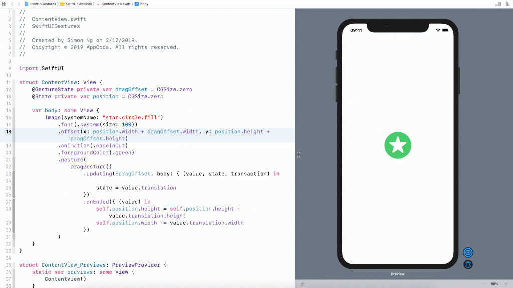
Now that you should understand how to use the .gesture modifier and @GestureState, let’s look into another common gesture: Drag. What we are going to do is modify the existing code to support the drag gesture, allowing a user to drag the star image to move it around.
Now replace the ContentView struct like this:
struct ContentView: View {
    @GestureState private var dragOffset = CGSize.zero

    var body: some View {
        Image(systemName: "star.circle.fill")
            .font(.system(size: 100))
            .offset(x: dragOffset.width, y: dragOffset.height)
            .animation(.easeInOut)
            .foregroundColor(.green)
            .gesture(
                DragGesture()
                    .updating($dragOffset, body: { (value, state, transaction) in

                        state = value.translation
                    })
            )
    }
}
To recognize a drag gesture, you initialize a DragGesture instance and listen to the update. In the update function, we pass a gesture state property to keep track of the drag event. Similar to the long press gesture, the closure of the update function accepts three parameters. In this case, the value parameter stores the current data of the drag including the translation. This is why we set the state variable, which is actually the dragOffset, to value.translation.
Run the project in the preview canvas, you can drag the image around. And, when you release it, the image returns to its original position.
Do you know why the image returns to its starting point? As explained in the previous section, one advantage of using @GestureState is that it will reset the value of the property to the original value when the gesture ends. So, when you release the finger to end the drag, the dragOffset is reset to .zero, which is the original position.
But what if you want to keep the image to stay at the end point of the drag? How can you do that? Give yourself a few minutes to think about the implementation.
Since the @GestureState property wrapper will reset the property to its original value, we need another state property to save the final position. Therefore, let’s declare a new state property like this:
@State private var position = CGSize.zeroNext, update the body variable like this:
var body: some View {
    Image(systemName: "star.circle.fill")
        .font(.system(size: 100))
        .offset(x: position.width + dragOffset.width, y: position.height + dragOffset.height)
        .animation(.easeInOut)
        .foregroundColor(.green)
        .gesture(
            DragGesture()
                .updating($dragOffset, body: { (value, state, transaction) in

                    state = value.translation
                })
                .onEnded({ (value) in
                    self.position.height += value.translation.height
                    self.position.width += value.translation.width
                })
        )
}
We have made a couple of changes in the code:
- Other than the
updatefunction, we also implemented theonEndedfunction which is called when the drag gesture ends. In the closure, we compute the new position of the image by adding the drag offset. - The
.offsetmodifier was also updated, such that we took the current position into account.
Now when you run the project and drag the image, the image stays where it is even after the drag ends.
Combining Gestures
In some cases, you need to use multiple gesture recognizers in the same view. Let’s say, if we want the user to press and hold the image before starting the drag, we have to combine both long press and drag gestures. SwiftUI allows you to easily combine gestures to perform more complex interactions. It provides three gesture composition types including simultaneous, sequenced, and exclusive.
When you need to detect multiple gestures at the same time, you use the simultaneous composition type. And, when you combine gestures exclusively, SwiftUI recognizes all the gestures you specify but it will ignore the rest when one of the gestures is detected.
As the name suggests, if you combine multiple gestures using the sequenced composition type, SwiftUI recognizes the gestures in a specific order. This is exactly the type of the composition that we will use to sequence the long press and drag gestures.
To work with multiple gestures, you can update the code like this:
struct ContentView: View {
    // For long press gesture
    @GestureState private var isPressed = false

    // For drag gesture
    @GestureState private var dragOffset = CGSize.zero
    @State private var position = CGSize.zero

    var body: some View {
        Image(systemName: "star.circle.fill")
            .font(.system(size: 100))
            .opacity(isPressed ? 0.5 : 1.0)
            .offset(x: position.width + dragOffset.width, y: position.height + dragOffset.height)
            .animation(.easeInOut)
            .foregroundColor(.green)
            .gesture(
                LongPressGesture(minimumDuration: 1.0)
                .updating($isPressed, body: { (currentState, state, transaction) in
                    state = currentState
                })
                .sequenced(before: DragGesture())
                .updating($dragOffset, body: { (value, state, transaction) in

                    switch value {
                    case .first(true):
                        print("Tapping")
                    case .second(true, let drag):
                        state = drag?.translation ?? .zero
                    default:
                        break
                    }

                })
                .onEnded({ (value) in

                    guard case .second(true, let drag?) = value else {
                        return
                    }

                    self.position.height += drag.translation.height
                    self.position.width += drag.translation.width
                })
            )
    }
}
You should be very familiar with part of the code snippet because we are combining the long press gesture that we have built with the drag gesture.
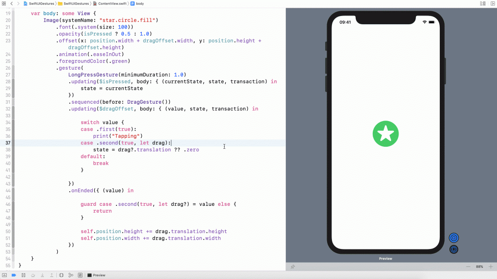
Let me explain the code in the .gesture modifier line by line. We require the user to press and hold the image for at least one second before he/she can begin the dragging. So, we start by creating the LongPressGesture. Similar to what we have implemented before, we have a isPressed gesture state property. When someone taps the image, we will alter the opacity of the image.
The sequenced keyword is how we can link the long press and drag gestures together. We tell SwiftUI that the LongPressGesture should happen before the DragGesture.
The code in both updating and onEnded functions looks pretty similar, but the value parameter now actually contains two gestures (i.e. long press and drag). This is why we have the switch statement to differentiate the gesture. You can use the .first and .second cases to find out which gesture to handle. Since the long press gesture should be recognized before the drag gesture, the first gesture here is the long press gesture. In the code, we do nothing but just print the Tapping message for your reference.
When the long press is confirmed, we will reach the .second case. Here, we pick up the drag data and update the dragOffset with the corresponding translation.
When the drag ends, the onEnded function will be called. Similarly, we update the final position by figuring out the drag data (i.e. .second case).
Now you’re ready to test the gesture combination. Run the app in the preview canvas using the debug, so you can see the message in the console. You can’t drag the image until holding the star image for at least one second.
Refactoring the Code Using Enum
A better way to organize the drag state is by using Enum. This allows you to combine the isPressed and dragOffset state into a single property. Let’s declare an enumeration called DragState.
enum DragState {
    case inactive
    case pressing
    case dragging(translation: CGSize)

    var translation: CGSize {
        switch self {
        case .inactive, .pressing:
            return .zero
        case .dragging(let translation):
            return translation
        }
    }

    var isPressing: Bool {
        switch self {
        case .pressing, .dragging:
            return true
        case .inactive:
            return false
        }
    }
}
We have three states here: inactive, pressing, and dragging. These states are good enough to represent the states during the performance of the long press and drag gestures. For the dragging state, it’s associated with the translation of the drag.
With the DragState enum, we can modify the original code like this:
struct ContentView: View {
    @GestureState private var dragState = DragState.inactive
    @State private var position = CGSize.zero

    var body: some View {
        Image(systemName: "star.circle.fill")
            .font(.system(size: 100))
            .opacity(dragState.isPressing ? 0.5 : 1.0)
            .offset(x: position.width + dragState.translation.width, y: position.height + dragState.translation.height)
            .animation(.easeInOut)
            .foregroundColor(.green)
            .gesture(
                LongPressGesture(minimumDuration: 1.0)
                .sequenced(before: DragGesture())
                .updating($dragState, body: { (value, state, transaction) in

                    switch value {
                    case .first(true):
                        state = .pressing
                    case .second(true, let drag):
                        state = .dragging(translation: drag?.translation ?? .zero)
                    default:
                        break
                    }

                })
                .onEnded({ (value) in

                    guard case .second(true, let drag?) = value else {
                        return
                    }

                    self.position.height += drag.translation.height
                    self.position.width += drag.translation.width
                })
            )
    }
}
We now declare a dragState property to track the drag state. By default, it’s set to DragState.inactive. The code is nearly the same except that it’s modified to work with dragState instead of isPressed and dragOffset. For example, for the .offset modifier, we retrieve the drag offset from the associated value of the dragging state.
The result of the code is the same. However, it’s always a good practice to use Enum to track complicated states of gestures.
Building a Generic Draggable View
So far, we have built a draggable image view. What if we want to build a draggable text view? Or what if we want to create a draggable circle? Should you copy and paste all the code to create the text view or circle?
There is always a better way to implement that. Let’s see how we can build a generic draggable view.
In the project navigator, right click the SwiftUIGestures folder and choose New File…. Select the SwiftUI View template and name the file DraggableView.
Declare the DragState enum and update the DraggableView struct like this:
enum DragState {
    case inactive
    case pressing
    case dragging(translation: CGSize)

    var translation: CGSize {
        switch self {
        case .inactive, .pressing:
            return .zero
        case .dragging(let translation):
            return translation
        }
    }

    var isPressing: Bool {
        switch self {
        case .pressing, .dragging:
            return true
        case .inactive:
            return false
        }
    }
}

struct DraggableView<Content>: View where Content: View {
    @GestureState private var dragState = DragState.inactive
    @State private var position = CGSize.zero

    var content: () -> Content

    var body: some View {
        content()
            .opacity(dragState.isPressing ? 0.5 : 1.0)
            .offset(x: position.width + dragState.translation.width, y: position.height + dragState.translation.height)
            .animation(.easeInOut)
            .gesture(
                LongPressGesture(minimumDuration: 1.0)
                .sequenced(before: DragGesture())
                .updating($dragState, body: { (value, state, transaction) in

                    switch value {
                    case .first(true):
                        state = .pressing
                    case .second(true, let drag):
                        state = .dragging(translation: drag?.translation ?? .zero)
                    default:
                        break
                    }

                })
                .onEnded({ (value) in

                    guard case .second(true, let drag?) = value else {
                        return
                    }

                    self.position.height += drag.translation.height
                    self.position.width += drag.translation.width
                })
            )
    }
}
All the code are very similar to what you’ve written before. The tricks are to declare the DraggableView as a generic view and create a content property. This property accepts any View and we power this content view with the long press and drag gestures.
Now you can test this generic view by replacing the DraggableView_Previews like this:
struct DraggableView_Previews: PreviewProvider {
    static var previews: some View {
        DraggableView() {
            Image(systemName: "star.circle.fill")
                .font(.system(size: 100))
                .foregroundColor(.green)
        }
    }
}
In the code, we initalize a DraggableView and provide our own content, which is the star image. In this case, you should achieve the same star image which supports the long press and drag gestures.
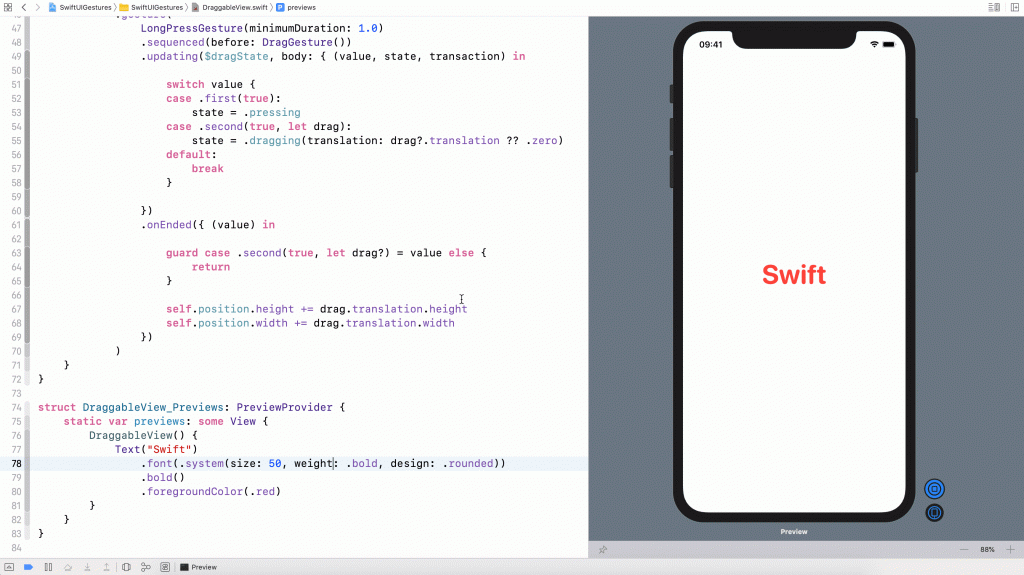
So, what if we want to build a draggable text view? You can replace the code snippet with the following code:
struct DraggableView_Previews: PreviewProvider {
    static var previews: some View {
        DraggableView() {
            Text("Swift")
                .font(.system(size: 50, weight: .bold, design: .rounded))
                .bold()
                .foregroundColor(.red)
        }
    }
}
In the closure, we create a text view instead of the image view. If you run the project in the preview canvas, you can drag the text view to move it around. Isn’t it cool?
If you want to create a draggable circle, you can replace the code like this:
struct DraggableView_Previews: PreviewProvider {
    static var previews: some View {
        DraggableView() {
            Circle()
                .frame(width: 100, height: 100)
                .foregroundColor(.purple)
        }
    }
}
That’s how you can create a generic draggable. Try to replace the circle with other views to make your own draggable view and have fun!
Summary
The SwiftUI framework has made gesture handling very easy. As you’ve learned in this chapter, the framework has provided several ready to use gesture recognizers. To enable a view to support a certain type of gestures, all you need to do is attach it with the .gesture modifier. Composing multiple gestures has never been so simple.
It’s a growing trend to build a gesture driven user interface for mobile apps. With the easy to use API, try to power your apps with some useful gestures to delight your users.
If you find this tutorial helpful, you may want to check out our “Mastering SwiftUI” book. We will dive a little deeper into SwiftUI gestures and show you how to create an expandable bottom sheet, similar to that you can find in the Facebook app.


