

The Charts framework is one of my favourite features for the new version of SwiftUI in iOS 16. Prior to iOS 16, you need to build your own charts or rely on third party library to render charts for you. With the release of this new framework, Apple has made it very easy for developers to create animated and interactive charts.
I have briefly discussed the usage of the Charts API in this post. For this tutorial, let’s see how to use the APIs to create a line chart.
The Weather Data
To demonstrate the SwiftUI Charts API, we will create a line chart that displays the average temperature of Hong Kong, Taipei, and London from 2021-Jul to 2022-Jun.
To store the weather data, I created a WeatherData struct like below:
struct WeatherData: Identifiable {
    let id = UUID()
    let date: Date
    let temperature: Double

    init(year: Int, month: Int, day: Int, temperature: Double) {
        self.date = Calendar.current.date(from: .init(year: year, month: month, day: day)) ?? Date()
        self.temperature = temperature
    }
}
The Chart initializer takes in a list of Identifiable objects. This is why we make the WeatherData conform the Identifiable protocol.
For each city, we create an array to store the weather data. Here is an example for London:
let londonWeatherData = [ WeatherData(year: 2021, month: 7, day: 1, temperature: 19.0),
                          WeatherData(year: 2021, month: 8, day: 1, temperature: 17.0),
                          WeatherData(year: 2021, month: 9, day: 1, temperature: 17.0),
                          WeatherData(year: 2021, month: 10, day: 1, temperature: 13.0),
                          WeatherData(year: 2021, month: 11, day: 1, temperature: 8.0),
                          WeatherData(year: 2021, month: 12, day: 1, temperature: 8.0),
                          WeatherData(year: 2022, month: 1, day: 1, temperature: 5.0),
                          WeatherData(year: 2022, month: 2, day: 1, temperature: 8.0),
                          WeatherData(year: 2022, month: 3, day: 1, temperature: 9.0),
                          WeatherData(year: 2022, month: 4, day: 1, temperature: 11.0),
                          WeatherData(year: 2022, month: 5, day: 1, temperature: 15.0),
                          WeatherData(year: 2022, month: 6, day: 1, temperature: 18.0)
]
To store the weather data of the cities, we also have an array for that:
let chartData = [ (city: "Hong Kong", data: hkWeatherData),
                  (city: "London", data: londonWeatherData),
                  (city: "Taipei", data: taipeiWeatherData) ]
Creating a Simple Line Chart Using Chart and LineMark
To create any types of chart using the Charts framework, you have to first import the Chartsframework:
import ChartsNext, you start with the Chart view. Inside the Chart view, you provide a set of LineMark to create a line chart. Here is an example:
struct SimpleLineChartView: View {
var body: some View {
VStack {
Chart {
ForEach(hkWeatherData) { item in
LineMark(
x: .value("Month", item.date),
y: .value("Temp", item.temperature)
)
}
}
.frame(height: 300)
}
}
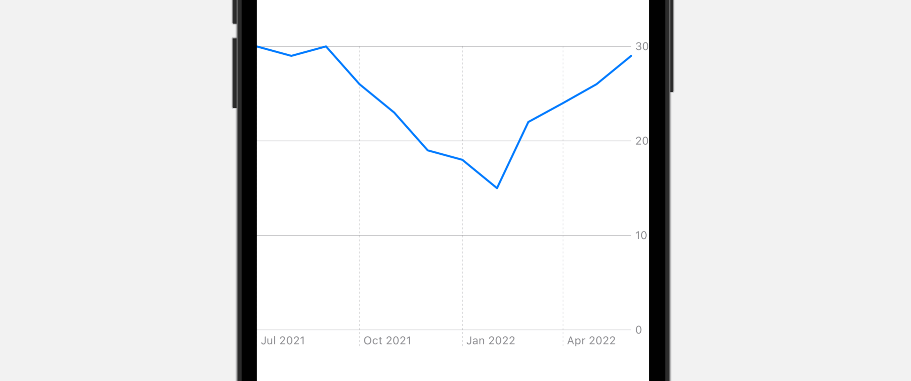
}What the code above does is to plot a line chart for displaying the average temperature of Hong Kong. The ForEach statement loops through all items stored in hkWeatherData. For each item, we create a LineMark object that the x axis is set to the date and the y axis is set to the average temperature.
Optionally, you can resize the chart using the frame modifier. If you preview the code in Xcode preview, you should see the following line chart:
Customizing Chart Axes
You can customize both x and y axes by using the chartXAxis and chartYAxis modifiers respectively. Let’s say, if we want to display the month labels using the digit format, we can attach the chartXAxis modifier to the Chart view like this:
.chartXAxis {
AxisMarks(values: .stride(by: .month)) { value in
AxisGridLine()
AxisValueLabel(format: .dateTime.month(.defaultDigits))
}
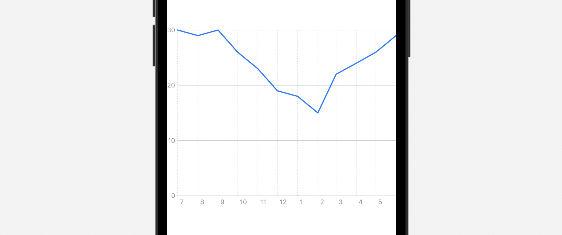
}Inside chartXAxis , we create a visual mark called AxisMarks for the values of month. For each value, we display a value label by using a specific format. This line of code tells SwiftUI chart to use the digit format:
.dateTime.month(.defaultDigits)On top of that, we added some grid lines by using AxisGridLine.
For the y-axis, instead of display the axis on the trailing (or right) side, we want to switch it to the leading (or left) side. To do that, attach the chartYAxis modifier like this:
.chartYAxis {
    AxisMarks(position: .leading)
}
If you’ve made the change, Xcode preview should update the chart like below. The y-axis is moved to the left side and the format of month is changed. Plus, you should see some grid lines.
Customizing the Background Color of the Plot Area
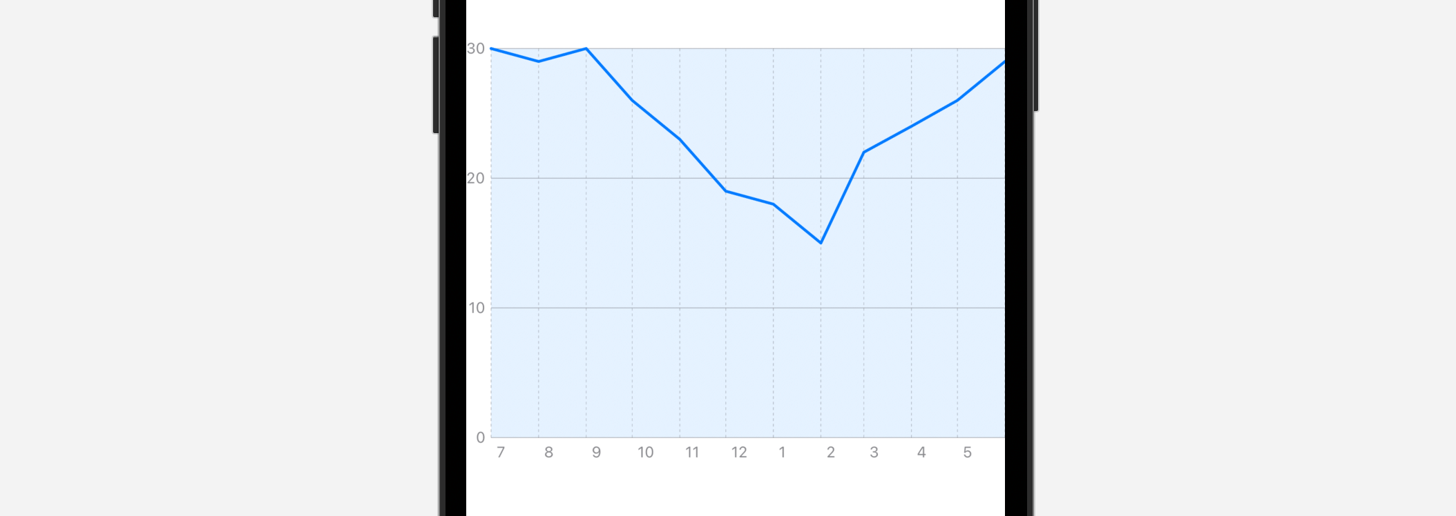
The chartPlotStyle modifier allows you to change the background color of the plot area. Attach the modifier to the Chart view like this:
.chartPlotStyle { plotArea in
    plotArea
        .background(.blue.opacity(0.1))
}
We can then change the plot area using the background modifier. As an example, we change the plot area to light blue.
Creating a Multi-line Chart
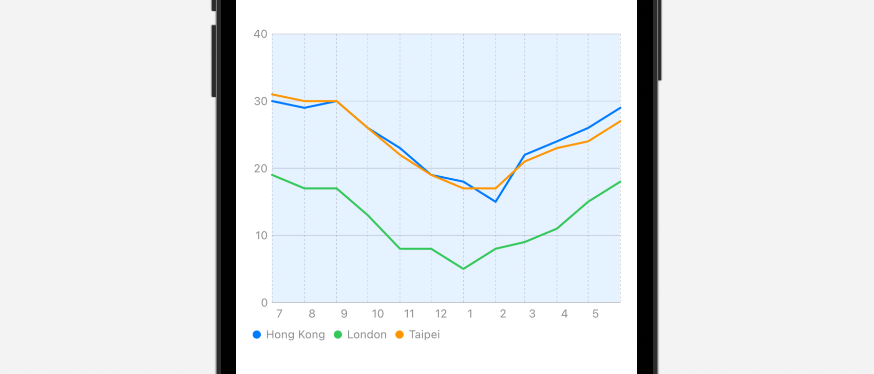
Now the chart displays a single source of data (i.e. the weather data of Hong Kong), so how can we display the weather data of London and Taipei in the same line chart?
You can rewrite the code of Chart view like this:
Chart {
ForEach(chartData, id: \.city) { series in
ForEach(series.data) { item in
LineMark(
x: .value("Month", item.date),
y: .value("Temp", item.temperature)
)
}
.foregroundStyle(by: .value("City", series.city))
}
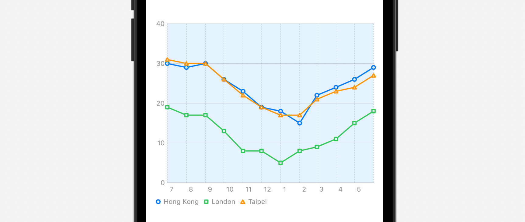
}We have another ForEach to loop through all the cities of the chart data. Here, the foregroundStyle modifier is used to apply a different color for each line. You don’t have to specify the color. SwiftUI will automatically pick the color for you.
Right now, all the cities share the same symbol. If you want to use a distinct symbol, place the following line of code after foregroundStyle:
.symbol(by: .value("City", series.city))Now each city has its own symbol in the line chart.
Customizing the Interpolation Method
You can alter the interpolation method of the line chart by attaching the interpolationMethod modifier to LineMark. Here is an example:
.interpolationMethod(.stepStart)If you change the interpolation method to .stepStart, the line chart now looks like this:
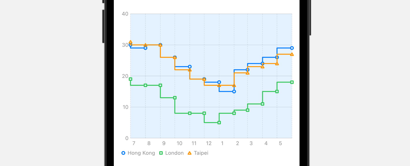
Other than .stepStart, you can try out the following options:
- cardinal
- catmullRom
- linear
- monotone
- stepCenter
- stepEnd
Summary
The Charts framework is a great addition to SwiftUI. Even if you just begin learning SwiftUI, you can create delightful charts with a few lines of code. While this tutorial focuses on line charts, the Charts API makes it very easy for developers to convert the chart to other forms such as bar chart. You can check out the Swift Charts documentation for further reading.
Note: We are updating our Mastering SwiftUI book for iOS 16. If you want to start learning SwiftUI, check out the book here. You will receive a free update later this year.


