

Toggle in SwiftUI is one of the most used views that it allows users to switch between two states, either on or off. This control is a great way to provide a simple and intuitive interface for your users, making it a popular choice for many developers.For example, you might use a toggle in your app to turn on and off certain features, or to switch between different modes or options. Toggle is very easy to implement in your SwiftUI applications. With the ToggleStyle protocol, you can create toggles that match your app’s design and branding.
In this tutorial, I will walk you through this Toggle view and show you how to build several custom toggles using ToggleStyle.
The Basics of Toggle
There are multiple ways to use the Toggle view in SwiftUI. The basic usage is like below:
struct ContentView: View {
@State private var isEnabled = false
var body: some View {
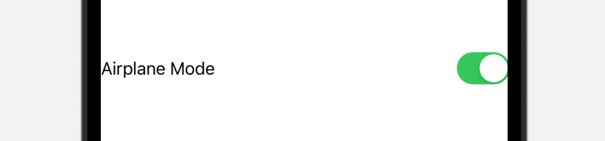
Toggle("Airplane Mode", isOn: $isEnabled)
}
}Here, we initialize a Toggle view with a text description and a binding. The state of the toggle is controlled by the state variable. This renders a basic toggle with a text label as shown above.
If you want to customize the text style, Toggle also provides an another initializer. You can set the visual appearance of the Text view in the closure like this:
Toggle(isOn: $isEnabled) {
Text("Airplane mode")
.font(.system(.title, design: .rounded))
.bold()
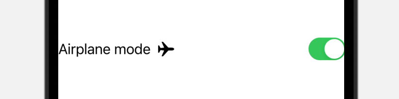
}You can further customize the description to include an image like this:
Toggle(isOn: $isEnabled) {
    HStack {
        Text("Airplane mode")
        Image(systemName: "airplane")

    }
    .font(.system(size: 20))
}
This results in a switch with a more visually appealing design.
Changing the Toggle Style
By default, the Toggle view uses the switch style. You can use the .toggleStyle modifier to change the style from switch to button:
.toggleStyle(.button)Say, if you want to create a bookmark button, you can create it using the code below:
struct ContentView: View {
    @State private var isBookmarked = false

    var body: some View {
        Toggle(isOn: $isBookmarked) {
            Image(systemName: isBookmarked ? "bookmark.fill" : "bookmark")
                .font(.system(size: 50))
        }
        .tint(.green)
        .toggleStyle(.button)
        .clipShape(Circle())
    }
}
The usage is very similar except that we tell Toggle to use the .button toggle style using the .toggleStyle modifier. In this case, instead of displaying the toggle as a switch, SwiftUI shows a button that alters its appearance depending on the state.

Using ToggleStyle to Create a Custom Toggle
In most cases, the default toggle style is sufficient, but there may be instances where you want to create a custom style to match the aesthetics of your app better. Now let’s see how to create our own custom toggle. In brief, you adopt the ToggleStyle protocol and implement the required makeBody(configuration:) function to create your own style:
struct CustomToggleStyle: ToggleStyle {
    func makeBody(configuration: Configuration) -> some View {
        // Your implementation
    }
}
Let’s start with a simple task. We’re going to construct a toggle switch with a customizable background color and symbol.
To do that, we create a new struct named SymbolToggleStyle that conforms to the ToggleStyle protocol:
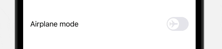
struct SymbolToggleStyle: ToggleStyle {

    var systemImage: String = "checkmark"
    var activeColor: Color = .green

    func makeBody(configuration: Configuration) -> some View {
        HStack {
            configuration.label

            Spacer()

            RoundedRectangle(cornerRadius: 30)
                .fill(configuration.isOn ? activeColor : Color(.systemGray5))
                .overlay {
                    Circle()
                        .fill(.white)
                        .padding(3)
                        .overlay {
                            Image(systemName: systemImage)
                                .foregroundColor(configuration.isOn ? activeColor : Color(.systemGray5))
                        }
                        .offset(x: configuration.isOn ? 10 : -10)

                }
                .frame(width: 50, height: 32)
                .onTapGesture {
                    withAnimation(.spring()) {
                        configuration.isOn.toggle()
                    }
                }
        }
    }
}
The struct takes in two parameters: one is the image name of the symbol and the other is the color of the switch. In the makeBody function, we build the toggle from the ground up. This includes placing the text label on one side and the switch on the other.
The configuration parameter gives us two pieces of information: the text label (i.e. configuration.label) and the state (i.e. configuration.isOn) of the toggle. In the code above, we arrange the text label and the rounded rectangle using HStack. We built the switch by overlaying a circle on top of it. To display a symbol, we further overlay an image view on top of the circle. By default, the image is set to display a checkmark.
As mentioned, we actually create the switch from scratch. This is why we need to handle the tap gesture and toggle the state of the switch. And, when the state changes, we move the circle by changing the offset value.
To use this custom toggle style, we can apply the toggleStyle modifier like this:
Toggle(isOn: $isEnabled) {
    Text("Airplane mode")
}
.toggleStyle(SymbolToggleStyle(systemImage: "airplane", activeColor: .purple))
This creates a toggle using the SymbolToggleStyle.
Creating an Animated Image Toggle
Now let us construct another toggle style that shows different images for its enabled and disabled states. We’ll use these two images for the project:
- Image by pikisuperstar on Freepik (please name the image to “light.jpg”)
- Image by pikisuperstar on Freepik (please name the image to “dark.jpg”)
Once you downloaded the images, import them to the asset catalog of your SwiftUI project. We then create a new toggle style like this:
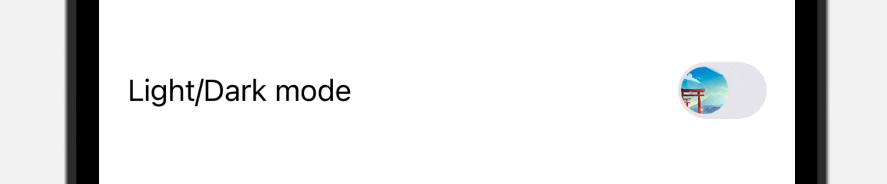
struct ImageToggleStyle: ToggleStyle {

    var onImage = "dark"
    var offImage = "light"

    func makeBody(configuration: Configuration) -> some View {

        HStack {
            configuration.label

            Spacer()

            RoundedRectangle(cornerRadius: 30)
                .fill(configuration.isOn ? .black : Color(.systemGray5))
                .overlay {
                    Image(configuration.isOn ? onImage : offImage)
                        .resizable()
                        .scaledToFill()
                        .clipShape(Circle())
                        .padding(5)
                        .rotationEffect(.degrees(configuration.isOn ? 0 : -360))
                        .offset(x: configuration.isOn ? 10 : -10)
                }
                .frame(width: 50, height: 32)
                .onTapGesture {
                    withAnimation(.spring()) {
                        configuration.isOn.toggle()
                    }
                }
        }
    }
}
This ImageToggleStyle struct accepts two parameters for the ON & OFF images. The implementation of the switch is very similar to that we discussed before. Instead of using a Circle view to create the switch, we use an image view to display the ON & OFF images.
We also added the rotationEffect modifier to animate the transition of the switch between the states.
Again, to use this toggle style, you can simply attach the .toggleStyle modifier to the Toggle view. Here is an example:
VStack {
    Toggle(isOn: $isEnabled) {
        Text("Light/Dark mode")
            .foregroundColor(isEnabled ? .white : .black)
    }
    .toggleStyle(ImageToggleStyle())
    .padding()
}
.frame(maxWidth: .infinity, maxHeight: .infinity)
.background(isEnabled ? .black.opacity(0.6) : .white)
Accessing the Toggle Style with Ease
To simplify the access of the custom toggle style, you can add a static variable in an extension to ToggleStyle as follows:
extension ToggleStyle where Self == ImageToggleStyle {

    static var image: ImageToggleStyle { .init() }
}
In this case, you can apply the toggle style using the dot syntax:
Toggle(isOn: $isEnabled) {
    Text("Light/Dark mode")
        .foregroundColor(isEnabled ? .white : .black)
}
.toggleStyle(.image)
What’s Next
In this tutorial, we’ve showed you the techniques of creating custom toggle styles in SwiftUI. With the help of the ToggleStyle protocol, you can craft visually appealing toggles that stand out from the crowd. If you’re eager to learn more about SwiftUI and the ToggleStyle protocol, be sure to check out our “Mastering SwiftUI” book for even more tips and tricks, plus complete source code.


