

All mobile applications, no matter what they are about, they have one common and obvious characteristic: They offer interaction, which means that they are not static, but require input or actions needed to be taken by users from time to time in order to function properly. One quite usual behavior, is the ability to provide ways that allow users to make choices or take decisions where it’s needed, and ultimately act that way on the applications’ data or functionalities. iOS SDK provides a pre-made action-taking view controller, the UIActionSheet.
Action sheets consist of a really convenient and fast way to display a bunch of options that the user should select from, and it is widely used in great number of applications. Its disadvantage though is that it adopts the iOS’s look and feel without being able to be graphically modified, therefore it might not fit to applications with customized GUI.
Beyond action sheets, another very important and cool tool designed especially for the iPad, is the UIPopoverController. A popover controller is actually a container which is used to display content on top of another content. What makes it unique is the fact that it can be displayed almost everywhere around the screen of the iPad, but usually it’s shown near to the button that caused its appearing with a nice arrow pointing to the button’s direction. iOS by default encloses action sheets in popover controllers on iPad, but they can also be manually created for custom content.

Before we begin working with those two view controllers, let’s do some more talking about them in order to get to know their basics, and then we’ll proceed on how to use them in projects. So, let me start by telling that both the UIActionSheet and UIPopoverController exist to serve the same purpose, and that is to provide a quick way for presenting content to the user. This content can be either a button-based menu (action sheet), or anything else originating from a view controller (popover controller). Undoubtably, they are both pretty useful tools, and everyone developing for iOS should master both of them. Their great difference lies to where each one is used, and that’s the essential fact you should be aware of: An action sheet can be used on any iOS device (iPhone, iPad), but a popover controller can be used only on iPad, as I have already said.
Focusing now a bit on the UIActionSheet, right next is shown a sample of it on iPhone (that’s an action sheet we’ll create next in this tutorial):

As you can see in the figure above, an action sheet can have three different kind of buttons: A destructive button displayed in red and usually used to highlight deletion actions, a cancel button that simply makes the action sheet to be dismissed, and a bunch of other normal buttons, whose number can vary depending on the provided options to the user. When an action sheet is presented, all of those buttons can be used, or just a combination of them, but surely the action sheet can’t be empty. We’ll see examples of that along our way in this tutorial.
When working on iPad, actions sheets are displayed embedded into popover controllers. From the developers’ point of view, no action is required for that, as the iOS automatically does it. However, it’s on the programmer’s hands to properly display the popover controller with the action sheet in it, and stay aligned to the Human Interface Guidelines. Further than that, keep in mind that the cancel button of the action sheet is not displayed on iPad, as tapping anywhere else but the action sheet is the same as tapping on the cancel button.
About the UIPopoverController now, the next figure illustrates a popover controller on iPad (again, this is a popover we’ll create in this tutorial later on):
If you have never worked with it, then it might sounds hard to make use of it. However, as you’ll ultimately find out, initializing and using popover controllers is just a matter of a couple of lines. Popovers are excellent tools, as they can show content almost anywhere you want around the screen. They are suitable for cases that user must interact in a quick fashion with a view controller, without losing from his eyes the current one. Besides that, the arrow pointing their origin is a beautiful visual effect, always attractive to the users.
If you feel you want to learn more theoretical stuff about action sheets or popover controllers, then visit Apple’s documentation and have an in-depth study. That’s something I definitely encourage you to do. However, now it is time to proceed and see how everything works in practice.
App Overview
Now that you have a taste of what we are going to work with in this tutorial, let’s take a glance at the sample application we are about to develop next. So, let me begin by saying that we will deal firstly with action sheets. We’ll see how they can be presented, how to customize the displayed options, and of course, how to handle the user response and actions. All that will be done for the iPhone device family initially, through simple and practical examples.
Next, we’ll see how action sheets work on iPad devices, and how they are displayed enclosed in popover controllers (UIPopoverController) automatically by the system. Actually, we will see how the examples implemented for the iPhone apply on iPad, and what differences may exist.
Finally, we’ll focus on the popover controller itself. We will programmatically initialize and display one, in which we’ll add the contents of a new view controller.
Everything will be presented in details, so if you are new to all these, be sure that you’ll definitely learn something when you reach the end of the tutorial. Having said all that, let’s get started.
App Creation
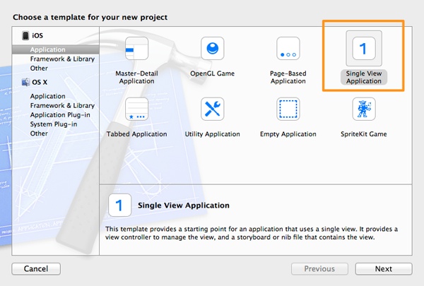
Let’s get started by creating the sample app of this tutorial. Launch Xcode and create a new project. In the first step of the guide that appears, select the Single View Application as the template of the app, in the Application category under the iOS section. Then click on the Next button.
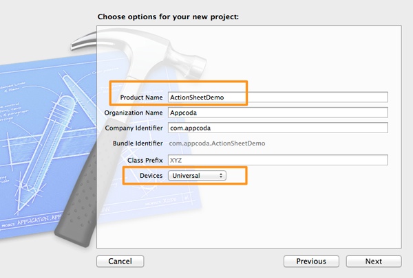
In the second step, in the Product Name field set the ActionSheetDemo value. Then in the Devices drop down menu, select the Universal option so it works on both the iPhone and the iPad. Once you do so, click on the Next button again.
Finally, in the last step select a destination directory to save the project and click Create. It is now ready, so we can keep on going with the UIActionSheet demonstration.
Presenting a UIActionSheet
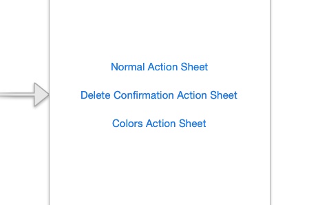
Now that there is a project to work on, let’s see how a UIActionSheet view controller can be displayed. Before doing so though, open the Main_iPhone.storyboard file by clicking on its name on the Project Navigator. Once the Interface Builder is appeared, add the following three UIButton objects, as described and shown below:
Button #1:
1. Title: Normal Action Sheet
2. Frame: X=81, Y=228, Width=159, Height=33
Button #2:
1. Title: Delete Confirmation Action Sheet
2. Frame: X=32, Y=269, Width=256, Height=33
Button #3:
1. Title: Colors Action Sheet
2. Frame: X=83, Y=310, Width=154, Height =33
Now, open the ViewController.h file, and declare the next three IBAction methods:
@interface ViewController : UIViewController

- (IBAction)showNormalActionSheet:(id)sender;

- (IBAction)showDeleteConfirmation:(id)sender;

- (IBAction)showColorsActionSheet:(id)sender;

@end
Then, return to the Interface Builder and connect each one to the appropriate button, matching the method names with the button titles. Get finished with that and then open the ViewController.m file to write some code.
Let’s begin by implementing the showNormalActionSheet: IBAction method, and let’s display our first action sheet. What you always have to do is to initialize a UIActionSheet object (either local or a class property) in the way that’s shown below:
 - (IBAction)showNormalActionSheet:(id)sender {

    UIActionSheet *actionSheet = [[UIActionSheet alloc] initWithTitle:@"What do you want to do with the file?"
                                                             delegate:self
                                                    cancelButtonTitle:@"Cancel"
                                               destructiveButtonTitle:@"Delete it"
                                                    otherButtonTitles:@"Copy", @"Move", @"Duplicate", nil];


}
As you may conclude from the above code, in this action sheet we hypothetically provide to the user some file handling options. Let’s talk a bit about the initialization method, which as you see it accepts a great number of parameters. The first one is a title that’s displayed on top of the action sheet with small letters, and usually is a prompt message or a question about the action that’s about to be taken. The second one is the delegate of the action sheet, which can be set to nil if you are not planning to implement any delegate method (something that’s really rare though), otherwise the self object is usually set. The cancelButtonTitle parameter accepts a desired title for the cancel button, which always is placed at the bottom of the action sheet, separately from the others, and as its name suggests, it simply forces the action sheet to be dismissed without any action performed. Next, the destructive button is a special button colored in red, and is used to indicate a critical action, such as a deletion. In the respective parameter you set its title. This button is always first in the buttons’ order. Finally, the otherButtonTitles parameter accepts a nil terminated string, and in here the titles of the rest buttons existing on the action sheet are set. All of the normal buttons are positioned between the destructive and the cancel button.
When initializing an action sheet, it’s not mandatory to have all kind of buttons if you don’t need them. To avoid a button’s appearance on the sheet, you simply set the nil value to the respective parameter and the button won’t appear. We’ll see that later.
Now, to make the action sheet appear when the button gets tapped, you need to add one more command right after the initialization:
- (IBAction)showNormalActionSheet:(id)sender {
    UIActionSheet *actionSheet = [[UIActionSheet alloc] initWithTitle:@"What do you want to do with the file?"
                                                             delegate:self
                                                    cancelButtonTitle:@"Cancel"
                                               destructiveButtonTitle:@"Delete it"
                                                    otherButtonTitles:@"Copy", @"Move", @"Duplicate", nil];

    [actionSheet showInView:self.view];
}
Before you test it, open the ViewController.h file and make our class conform to the UIActionSheetDelegate protocol. That’s necessary to fix the warning Xcode appears in the line where we declare self as the delegate of the action sheet. So, modify the interface header line as follows:
@interface ViewController : UIViewController
Build and run the application now for first time. Click on the Normal Action Sheet button, and the action sheet will appear. Pretty nice, don’t you think? With just a couple of lines we managed to implement an option menu and present it to the user.
Tap on any button you want and the action sheet will disappear. Even though it gets dismissed, for the time being we are unable to handle the tapped button. Don’t worry about that, we’ll fix it later on.
Customizing UIActionSheet Options
In the previous example, we created our first action sheet and we saw how it looks like when all of the buttons are used. However, such an action sheet might not always be suitable for every case you may encounter, and then you’ll definitely need to adjust the displayed options only to those you desire. I already mentioned previously that you can skip a button’s appearance if you simply set the nil value to the respective parameter value, and in this part of the tutorial we’ll see a couple of such examples.
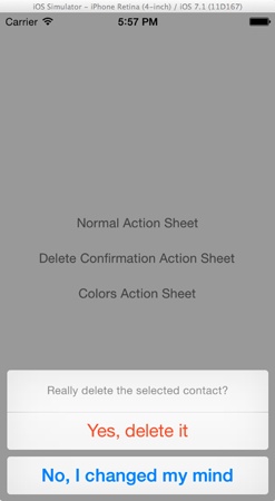
Let’s begin working with the second button we added to the view, titled Delete Confirmation Action Sheet. Let’s suppose that you have a table view full of contacts, and before deleting one you want to show a confirmation action sheet to the user. In that case, you would like to use a delete button to perform the actual deletion, and a cancel button just to dismiss it. This can be achieved easily, as long as you set to the otherButtonTitles parameter the nil value. The following IBAction implementation demonstrates exactly that (make sure you work on the ViewController.m file):
- (IBAction)showDeleteConfirmation:(id)sender {
    UIActionSheet *actionSheet = [[UIActionSheet alloc] initWithTitle:@"Really delete the selected contact?"
                                                             delegate:self
                                                    cancelButtonTitle:@"No, I changed my mind"
                                               destructiveButtonTitle:@"Yes, delete it"
                                                    otherButtonTitles:nil];

    [actionSheet showInView:self.view];
}
As you see, the title of the action sheet is in accordance to the current occasion. Further than that, you see that you can set any title you wish to both the delete and cancel buttons.
Now, run once again the application, and tap (or click on the Simulator) on the second button. Here’s you what you should see:
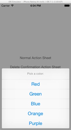
Let’s see now one more example. Let’s suppose you want to present an action sheet to let users select a color among five possible values, you don’t need of course to have a destructive button, and you don’t want to provide a cancel button too. In this case, you have to set the nil values to both the destructive and cancel button titles, and simply provide the nil terminated string with all the colors titles. The implementation of the next IBAction method shows just that:
- (IBAction)showColorsActionSheet:(id)sender {
    UIActionSheet *actionSheet = [[UIActionSheet alloc] initWithTitle:@"Pick a color:"
                                                             delegate:self
                                                    cancelButtonTitle:nil
                                               destructiveButtonTitle:nil
                                                    otherButtonTitles:@"Red", @"Green", @"Blue", @"Orange", @"Purple", nil];

    [actionSheet showInView:self.view];
}
If you run the application now, you’ll see that only simple buttons are displayed on the action sheet, while the destructive and cancel buttons have been omitted. Here’s a sample of what you should see on your screen when tapping on the third button:
Through these two examples it was made clear how you can use the provided kinds of buttons depending on your project’s needs. It’s amazingly easy to create a menu of options and show them to the user, make various button combinations, and as you’ll see right next, it’s very easy to handle the user response too. The only drawback is that you cannot modify the sheet’s visual style, and that can consist of a prohibitive reason for not using it to customized applications.
Handling Actions
The UIActionSheetDelegate protocol we previously adopted, provides a few delegate methods that can be used in order to fully control the user response to action sheets. In this section we are going to talk about all of them, and we’ll begin by the most commonly used one, the actionSheet:clickedButtonAtIndex:.
This method as you probably correctly guess, returns the index of the button that was tapped to an action sheet. You should always keep in mind that the index of the top most button is 0 (zero), and moving towards bottom the index gets increased by one. There will be times that you’ll want to get the title of the tapped button instead of its index. That’s easy to get, as the actionSheet parameter object supports a method named buttonTitleAtIndex:. Providing it simply with the tapped button index, you get the appropriate title. Also, in most of the times you’ll probably use a switch or an if structure in order to perform the appropriate action, depending on the user response.
When you have just one action sheet in your view controller, then it’s simple to handle it using this delegate method. However, when you have multiple action sheets just like here, then you must define in which one a button has been tapped. That can be achieved by setting a tag value to each action sheet. So, go to all three IBAction methods we previously implemented and set to each action sheet a tag value as shown below:
// showNormalActionSheet:
actionSheet.tag = 100;

// showDeleteConfirmation:
actionSheet.tag = 200;

// showColorsActionSheet:
actionSheet.tag = 300;
In the following implementation of the delegate method, we’ll show a message in the debugger, customized depending on the displayed action sheet. Also, we’ll log the tapped button index and its title:
-(void)actionSheet:(UIActionSheet *)actionSheet clickedButtonAtIndex:(NSInteger)buttonIndex{
    if (actionSheet.tag == 100) {
        NSLog(@"The Normal action sheet.");
    }
    else if (actionSheet.tag == 200){
        NSLog(@"The Delete confirmation action sheet.");
    }
    else{
        NSLog(@"The Color selection action sheet.");
    }

    NSLog(@"Index = %d - Title = %@", buttonIndex, [actionSheet buttonTitleAtIndex:buttonIndex]);
}
Test the app now. Depending on what action sheet you display and the button you tap, the respective message appears on the debugger.
Let’s go back to code, and let’s examine the rest of the delegate methods, which you may find useful in many situations during your programming life. The first one is the actionSheet:didDismissWithButtonIndex: method. This one works just like the previous one, but it gets called after the action sheet has been dismissed. The next code segment illustrates a simple use of it, where firstly we make sure that the dismissed action sheet’s tag value equals to 300, and then display the selected color name:
-(void)actionSheet:(UIActionSheet *)actionSheet didDismissWithButtonIndex:(NSInteger)buttonIndex{
    if (actionSheet.tag == 300) {
        NSLog(@"From didDismissWithButtonIndex - Selected Color: %@", [actionSheet buttonTitleAtIndex:buttonIndex]);
    }
}
Run the app once again, and tap on the third button. Select a color and look at your debugger. You’ll notice that the message from this method is logged with a small delay, and after the action sheet has disappeared.
Besides that method, there’s also the actionSheet:willDismissWithButtonIndex: one. On contrary to the above delegate method, this one is called before the action sheet gets dismissed. Implement it and add the same code as previously:
-(void)actionSheet:(UIActionSheet *)actionSheet willDismissWithButtonIndex:(NSInteger)buttonIndex{
    if (actionSheet.tag == 300) {
        NSLog(@"From willDismissWithButtonIndex - Selected Color: %@", [actionSheet buttonTitleAtIndex:buttonIndex]);
    }
}
Run the application again and watch your debugger. You’ll see that the message coming from this method is appeared before the action sheet disappears.
These are the delegate methods provided, but it’s almost certain that in 98% of cases the first one is what you’ll use.
Action Sheet on iPad
Up to this point, we’ve managed to learn the basic principles regarding the UIActionSheet, and the ways the user response can be handled. Also, our implementation was limited to iPhone-style devices only, as this is our primary device target when messing around with new stuff. However, now that theUIActionSheet essentials have become known, it’s important to see how action sheets should be treated when working on iPad devices, as things change a bit here.
If you ever developed for iPad, or if you are simply an iPad user, then you know that it contains a pretty nice view controller, not available on iPhone or iPod devices, the UIPopoverController. As I have already said in the introduction of the tutorial, the UIPopoverController is quite useful when it’s necessary to show contents next to a button, cell, or anything else that has triggered an action. iPad devices are suitable for using them, as the big screen leaves enough room to display them in various sizes.
So, going back to our previous talk, when an action sheet is necessary to be presented to an iPad, iOS encloses it into a UIPopoverController view. The really important clue here is that the cancel button does not appear on the action sheet, because the result of that button is the same to tapping out of the popover controller; both of those dismiss popover controller/action sheet without performing any task. The existence of the cancel button would be confusing for users, so Apple engineers designed it that way so it gets removed when the target device is an iPad.
Apart from the above, there are also differences on the way an action sheet is shown, programmatically speaking this time. Before getting into those details though, it would be more meaningful and rewarding to see everything in practice, so let me make a turn and guide you from another path.
On the Project Navigator pane, click on the Main_iPad.storyboard file to let the iPad interface appear in the Interface Builder. Add the three buttons we added on the iPhone interface here too, as my goal is to demonstrate how similar things are handled differently in both devices. The button details:
Button #1:
1. Title: Normal Action Sheet
2. Frame: X=313, Y=459, Width=142, Height=30
Button #2:
1. Title: Delete Confirmation Action Sheet
2. Frame: X=270, Y=497, Width=229, Height=33
Button #3:
1. Title: Colors Action Sheet
2. Frame: X=316, Y=535, Width=137, Height =30

Finish with the button preparation and then connect the existing IBAction methods to them appropriately. When you are ready, go to the ViewController.m file and in the implementation of the showNormalActionSheet: method. If you followed the steps in the previous sections of the tutorial, here’s what it should look like:
- (IBAction)showNormalActionSheet:(id)sender {
    UIActionSheet *actionSheet = [[UIActionSheet alloc] initWithTitle:@"What do you want to do with the file?"
                                                             delegate:self
                                                    cancelButtonTitle:@"Cancel"
                                               destructiveButtonTitle:@"Delete it"
                                                    otherButtonTitles:@"Copy", @"Move", @"Duplicate", nil];

    [actionSheet showInView:self.view];

    actionSheet.tag = 100;
}
Run the app, but make sure to either select an iPad simulator device, or connect a real device directly. You must be watching a view similar to the next one if you tap (or click) on the first button:
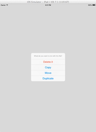
What you see is the default way an action sheet appears to an iPad, and as you notice the cancel button is missing. When tapping anywhere out of the popover view, you’ll see in the debugger the message from the actionSheet:clickedButtonAtIndex: method, just like if you were tapping on the cancel button.
The way the action sheet appears is not the best possible solution, as the purpose of the popover controller is to be displayed next to the control that triggers its appearance, and even more, an arrow pointing to that control should be visible too. Very rarely, almost never one could say, an action sheet appears just like that in the centre of the screen.
So, what can we do to overcome this? Well, only two steps are required. The first one is to define whether the device the app works is an iPhone/iPod or an iPad. In the second case, we just have to change the way the action sheet appears on the screen. In action now, go to the IBAction method, and right below the initialization of the action sheet, add the next condition:
if (UI_USER_INTERFACE_IDIOM() == UIUserInterfaceIdiomPad) {
        // In this case the device is an iPad.

    }
    else{
        // In this case the device is an iPhone/iPod Touch.
        [actionSheet showInView:self.view];
    }
With the UI_USER_INTERFACE_IDIOM() macro you can check if you have an iPad or iPhone user interface, and ultimately follow the one or another path. In the above code, we use the else case to present the action sheet normally to an iPhone/iPod Touch device.
If you run the app now, you’ll find out that when tapping on the first button nothing happens, and that’s totally normal as there’s nothing to be executed in the if clause. Return to the code, and add in the if body the next line:
[actionSheet showFromRect:[(UIButton *)sender frame] inView:self.view animated:YES];
This action sheet method accepts three parameters: The frame to be shown from, the view that it will be shown to, and a flag indicating an animating appearance or not. In our case, we want the popover controller of the action sheet to originate from the button that triggers its display, so in the showFromRect parameter we specify the frame of the sender button. The rest is easy. Now run the app again and tap on the first button. The result is the proper and desired one:

Below you are given all three IBAction methods modified appropriately, so the properly work for all devices:
- (IBAction)showNormalActionSheet:(id)sender {
    UIActionSheet *actionSheet = [[UIActionSheet alloc] initWithTitle:@"What do you want to do with the file?"
                                                             delegate:self
                                                    cancelButtonTitle:@"Cancel"
                                               destructiveButtonTitle:@"Delete it"
                                                    otherButtonTitles:@"Copy", @"Move", @"Duplicate", nil];

    if (UI_USER_INTERFACE_IDIOM() == UIUserInterfaceIdiomPad) {
        // In this case the device is an iPad.
        [actionSheet showFromRect:[(UIButton *)sender frame] inView:self.view animated:YES];
    }
    else{
        // In this case the device is an iPhone/iPod Touch.
        [actionSheet showInView:self.view];
    }

    actionSheet.tag = 100;
}

- (IBAction)showDeleteConfirmation:(id)sender {
    UIActionSheet *actionSheet = [[UIActionSheet alloc] initWithTitle:@"Really delete the selected contact?"
                                                             delegate:self
                                                    cancelButtonTitle:@"No, I changed my mind"
                                               destructiveButtonTitle:@"Yes, delete it"
                                                    otherButtonTitles:nil];

    if (UI_USER_INTERFACE_IDIOM() == UIUserInterfaceIdiomPad) {
        // In this case the device is an iPad.
        [actionSheet showFromRect:[(UIButton *)sender frame] inView:self.view animated:YES];
    }
    else{
        // In this case the device is an iPhone/iPod Touch.
        [actionSheet showInView:self.view];
    }

    actionSheet.tag = 200;
}


- (IBAction)showColorsActionSheet:(id)sender {
    UIActionSheet *actionSheet = [[UIActionSheet alloc] initWithTitle:@"Pick a color:"
                                                             delegate:self
                                                    cancelButtonTitle:nil
                                               destructiveButtonTitle:nil
                                                    otherButtonTitles:@"Red", @"Green", @"Blue", @"Orange", @"Purple", nil];

    if (UI_USER_INTERFACE_IDIOM() == UIUserInterfaceIdiomPad) {
        // In this case the device is an iPad.
        [actionSheet showFromRect:[(UIButton *)sender frame] inView:self.view animated:YES];
    }
    else{
        // In this case the device is an iPhone/iPod Touch.
        [actionSheet showInView:self.view];
    }

    actionSheet.tag = 300;
}
Now you know how to distinguish the device in which your app runs, and how to properly present an action sheet. Go ahead and try out all three buttons to see how the action sheet appears on iPad:


You may notice that when showing the colors action sheet and then tapping out of the popover controller, the app crashes. That’s because there is not a cancel button. To counterattack it, in the showColorsActionSheet: method either instead of nil set a cancel button title, or at the top of the method add the next line:
NSString *cancelTitle = (UI_USER_INTERFACE_IDIOM() == UIUserInterfaceIdiomPad) ? @"Cancel" : nil;
and in the cancelButtonTitle parameter set the cancelTitle value. This time it will work perfectly.
Action Sheet Showing Extras
Until the last section of this tutorial we saw two ways for presenting an action sheet. The first one:
[actionSheet showInView:self.view];
works on all devices, while the next one:
[actionSheet showFromRect:[(UIButton *)sender frame] inView:self.view animated:YES];
has effect only on iPad. Further than those two methods, there are a few more that I consider as a good idea I should refer to, so let’s give them a quick look.
The first method we’ll talk about, is the showFromTabBar:, which as you guess is useful when there is a tab bar in your application. It mostly works on iPhone/iPod Touch devices, and its purpose is to allow an action sheet to properly appear without get overlapped by the tab bar. Actually, the action sheet originates from it and not from the view’s bottom side. On iPad the action sheet will simply appear on the centre of the screen, without any arrow pointing to some point.
Similar to the above is the showFromToolbar: method. It’s used when a toolbar exists at the bottom side of the view, and the action sheet must be properly shown without be overlapped by the toolbar.
Finally, there’s also the showFromBarButtonItem:animated: method, which is helpful on iPad for displaying an action sheet with its popover view pointing to the bar button item that triggered the appearing.
As you see, there are methods suitable for iPhone devices, and methods suitable for iPad devices. However, this doesn’t mean that they cannot be used the other way round. On iPhone, all methods have the same result and the action sheet is shown from the bottom side of the screen, or from the tab bar/toolbar. On iPad methods that do not display the popover with the action sheet to a specific place with a pointing arrow, they just show it to the centre of the screen. When displaying action sheets, always make sure that you use the appropriate method for presenting them so as to make sure that you are aligned to the recommended interface guidelines.
Working with UIPopoverController
Now that we have talked about action sheets and how they are displayed on both iPhone and iPad devices, let’s do some more discussion about the UIPopoverController. Until now we referenced it a lot of times, but still we haven’t made any implementation that allow us to manually create and show one. So, in this part we will see how it can be used in general cases, as the purpose of its existence lies to usages other than simply displaying action sheets.
The great with the popover controller is that it can display the contents of any view controller to the position you define, usually near the button that triggers its appearance. It can get any size you want, and the arrow that points to the button that originates from, along with the fade effect, result to a very fancy, convenient and useful tool for presenting content on top of other content when working on iPad.
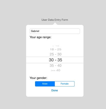
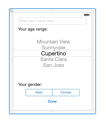
We will see how popover controller works through a practical example. We will use a new view controller and we will display its contents in the popover. This view controller will contain a sample user data form, where some basic info can be filled in and selected (user name, age range and gender). The following Interface Builder screenshot will make it more clear:
Also, the view controller will have its own xib file with the interface designed in it, which will be called upon initialization. Finally, through the implementation of a protocol and a delegate method we’ll get the entered/selected data from the new view controller back to the normal one.
To focus on the important stuff, we won’t manually create the new view controller. Instead, please go ahead to download the related files now, and add them to the project. Make sure you add all of the following files:
- TestViewController.h
- TestViewController.m
- TestViewController.xib
Supposing at this point that you have downloaded and added all files and you are ready to proceed, let’s create a new button to the iPad interface. Click on the Main_iPad.storyboard file, and let Interface Builder appear. Then, get a UIButton from the Object Library, and set the next properties:
- Frame: X=310, Y=239, Width=149, Height=30
- Title: User Data Entry Form
After that, open the ViewController.h file, and declare the following IBAction method:
- (IBAction)showUserDataEntryForm:(id)sender;
Return to the Interface Builder, and connect that action method to the newly added button.
Now, open once again the ViewController.h file, and firstly import the TestViewController class as shown below:
#import "TestViewController.h"
Also, make the ViewController class conform to the TestViewControllerDelegate protocol by adding it to the interface header line like below:
@interface ViewController : UIViewController
By adopting the above protocol, we’ll be able to use the delegate method of the TestViewController class later on and to get the entered data.
Now, let’s go to the most essential part of this section, to the implementation of the IBAction method we previously declared and to the usage of the popover controller. For starters though, we must declare a private class property for the popover, so open the ViewController.m and go to the private section of the interface. In there, add the following property declaration:
@interface ViewController ()

@property (nonatomic, strong) UIPopoverController *userDataPopover;

@end
Now, move straight ahead to the IBAction method implementation, where we will initialize and use the above object. As I already said in the beginning of this section, the special characteristic of the popover controller is the ability to display the contents of another view controller, therefore the first step we must make is to initialize an object of the TestViewController class.
- (IBAction)showUserDataEntryForm:(id)sender {
    TestViewController *testViewController = [[TestViewController alloc] initWithNibName:@"TestViewController" bundle:nil];
    testViewController.delegate = self;

}
As you see, upon initialization we load the view controller’s xib file as well, and beyond that, we make our class the delegate of the testViewController object. Now that we have a view controller on our hands, let’s use the popover controller object we privately declared and let it finally appear. We only need to add three commands, which we’ll see step by step. Initially, let’s perform the initialization:
self.userDataPopover = [[UIPopoverController alloc] initWithContentViewController:testViewController];
It’s obvious that the view controller we want to display is directly given as a parameter to the popover controller. That’s why we first declared and initialized the TestViewController object. The next step is to define the popover size, which usually matches the contained view’s size:
self.userDataPopover.popoverContentSize = CGSizeMake(320.0, 400.0);
Finally, let’s display it:
[self.userDataPopover presentPopoverFromRect:[(UIButton *)sender frame]
                                       inView:self.view
                     permittedArrowDirections:UIPopoverArrowDirectionAny
                                     animated:YES];
This method accepts four parameters as you can notice. The first one is the frame from which the popover originates, and usually is the button’s frame that is used to present it. The next one, is the view in which the popover controller will appear to. As you understand, it’s not always necessary to display it in the default view, but that’s the most common case. The third parameter specifies the direction of the arrow that appears on the popover controller, pointing to the button that originates from. Unless you make sure that the popover controller will always be displayed on the same place, then you’d better use UIPopoverArrowDirectionAny parameter to allow the system decide the position of the arrow. Don’t forget that when changing iPad’s orientation the popover controller can be re-positioned to a new place, and is quite possible that the arrow should point towards another direction. Finally, the last parameter specifies whether the popover will appear using animation or not, and usually that value is set to YES.
Here’s the whole IBAction method:
- (IBAction)showUserDataEntryForm:(id)sender {
    TestViewController *testViewController = [[TestViewController alloc] initWithNibName:@"TestViewController" bundle:nil];
    testViewController.delegate = self;

    self.userDataPopover = [[UIPopoverController alloc] initWithContentViewController:testViewController];
    self.userDataPopover.popoverContentSize = CGSizeMake(320.0, 400.0);
    [self.userDataPopover presentPopoverFromRect:[(UIButton *)sender frame]
                                       inView:self.view
                     permittedArrowDirections:UIPopoverArrowDirectionAny
                                     animated:YES];


}
If you give the app a try now, then when tapping on the new button existing on the interface you’ll see the popover controller appearing and containing the TestViewController interface. Cool and fast way to show some content, right?
Back to code now, let’s implement the delegate method of the TestViewController class, in which we’ll simply log on the debugger the entered and selected data, and the we will dismiss the popover controller. There’s nothing especially hard in it, so here I give you its implementation:
-(void)userDataChangedWithUsername:(NSString *)username andAgeRange:(NSString *)ageRange andGender:(NSString *)gender{
    NSLog(@"Your name is %@, your age range is %@ and your gender is %@", username, ageRange, gender);

    [self.userDataPopover dismissPopoverAnimated:YES];
}
Run the app once again now. You’ll find out that the Done button properly works, and on the debugger you see all the data you entered on the form. Also, the popover controller gets disappeared from the screen.
In most of cases, what you read in here is the way that you’ll need to use the popover controller. The “hard” thing is to prepare the view controller that it will be contained, along with all the logic behind it, not the popover itself. However, in the rare cases you might need to use delegate methods, first make sure that your class conforms to the UIPopoverControllerDelegate, and then proceed to the implementation. The provided delegates methods are:
- popoverControllerShouldDismissPopover: This one is called before the popover controller disappears from the screen.
- popoverControllerDidDismissPopover: This one is called after the popover controller has disappeared from the screen.
Use any, or both of them depending on your needs.
Summary
Reaching the end of this tutorial, it becomes clear that using action sheets and popover controllers consist of a very easy, fast and convenient way to present menus and content to the user. The great common element on both of them, is the fact that they can be presented almost instantly, with a little effort. The only drawback is that they may do not fit to the ecosystem on highly customized applications, but that’s something that developers know from the beginning. Closing, in case you don’t use any or both of these view controllers, I would advise you to start doing so, as they are time-saving tools and even more, it’s possible to make your apps look even more professional. Happy… action-taking!
For your reference, you can download the complete Xcode project from here. Again, leave me comment if you have any questions.


